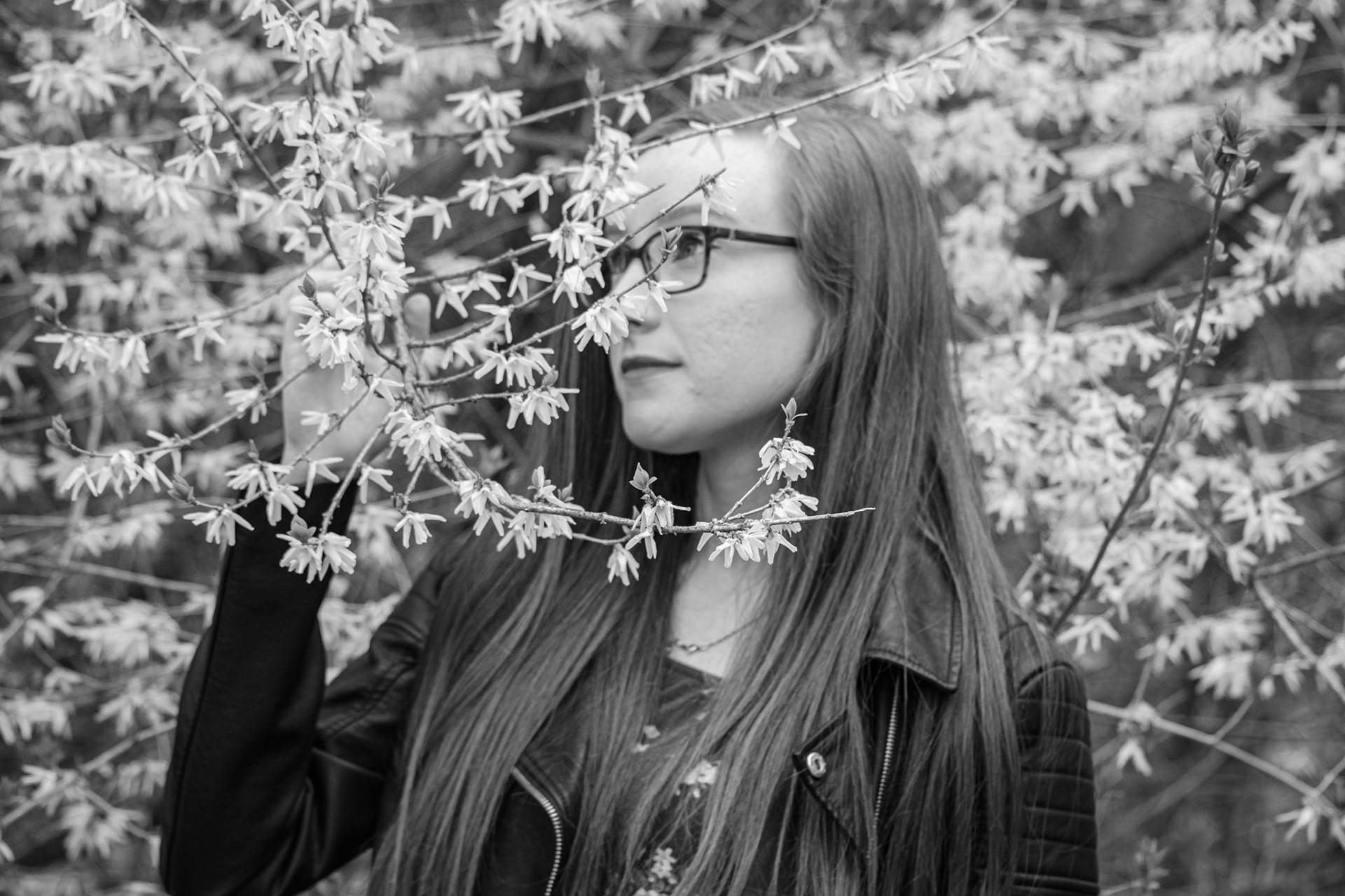
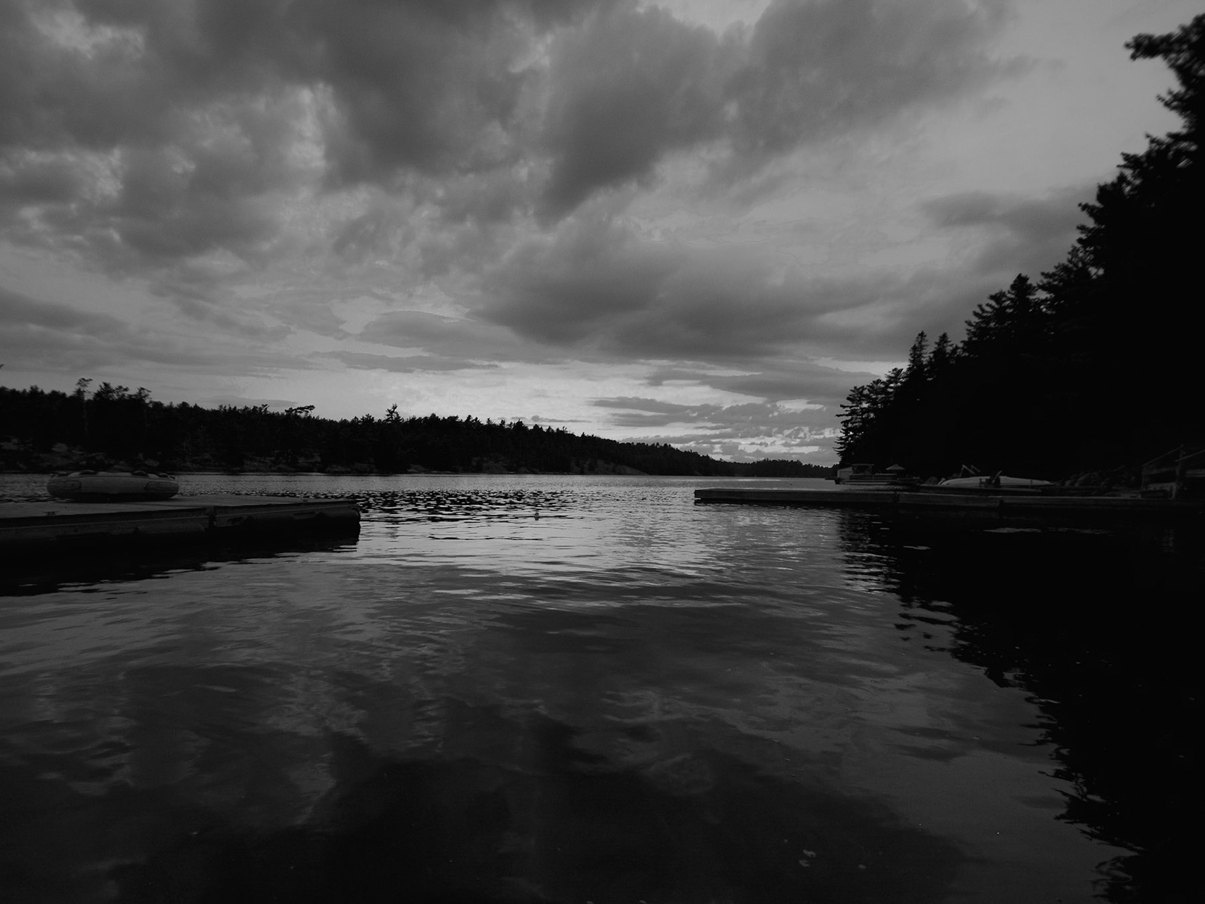
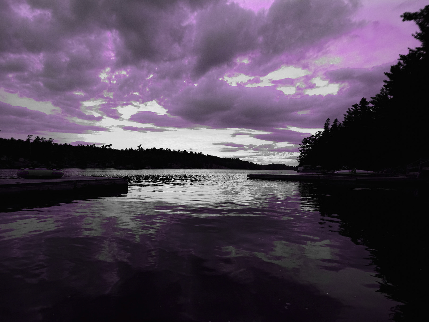
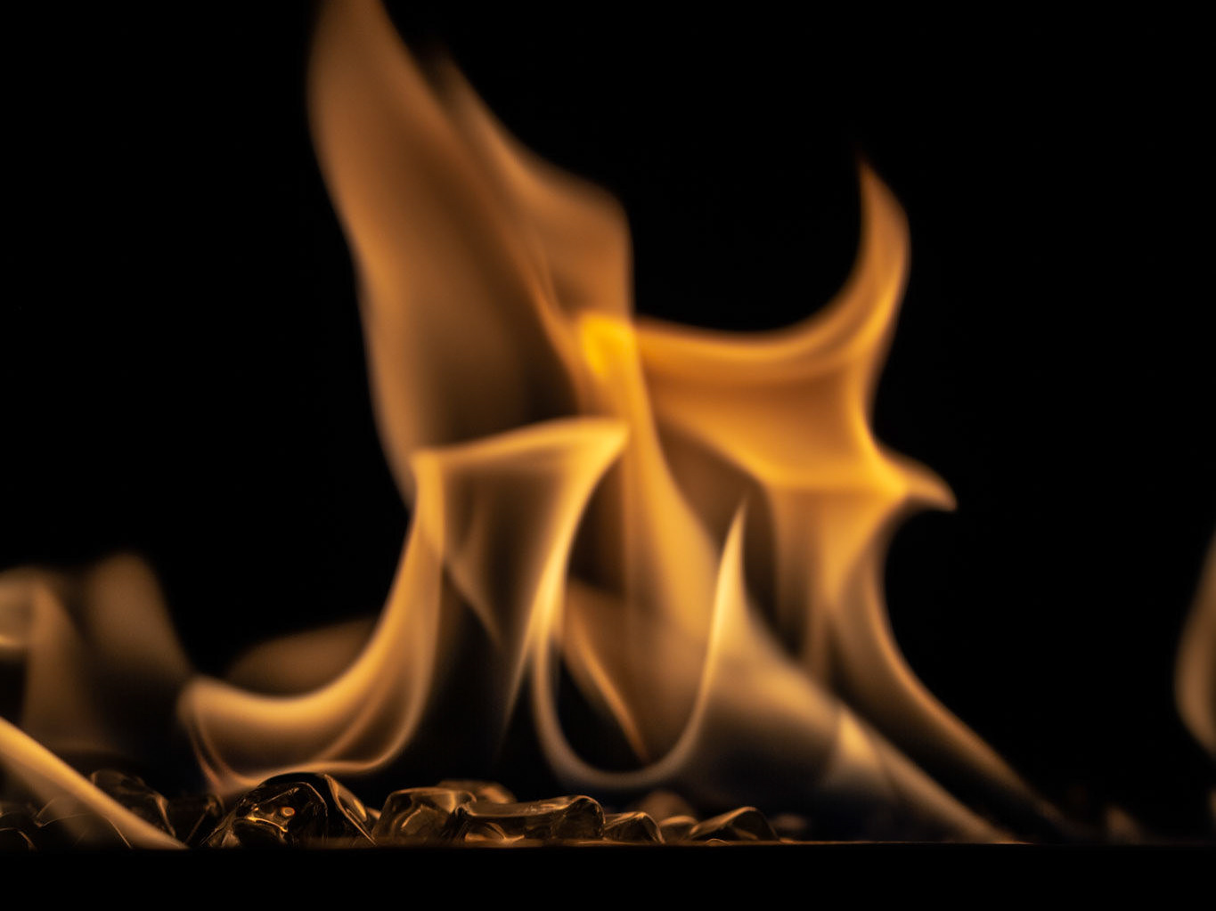
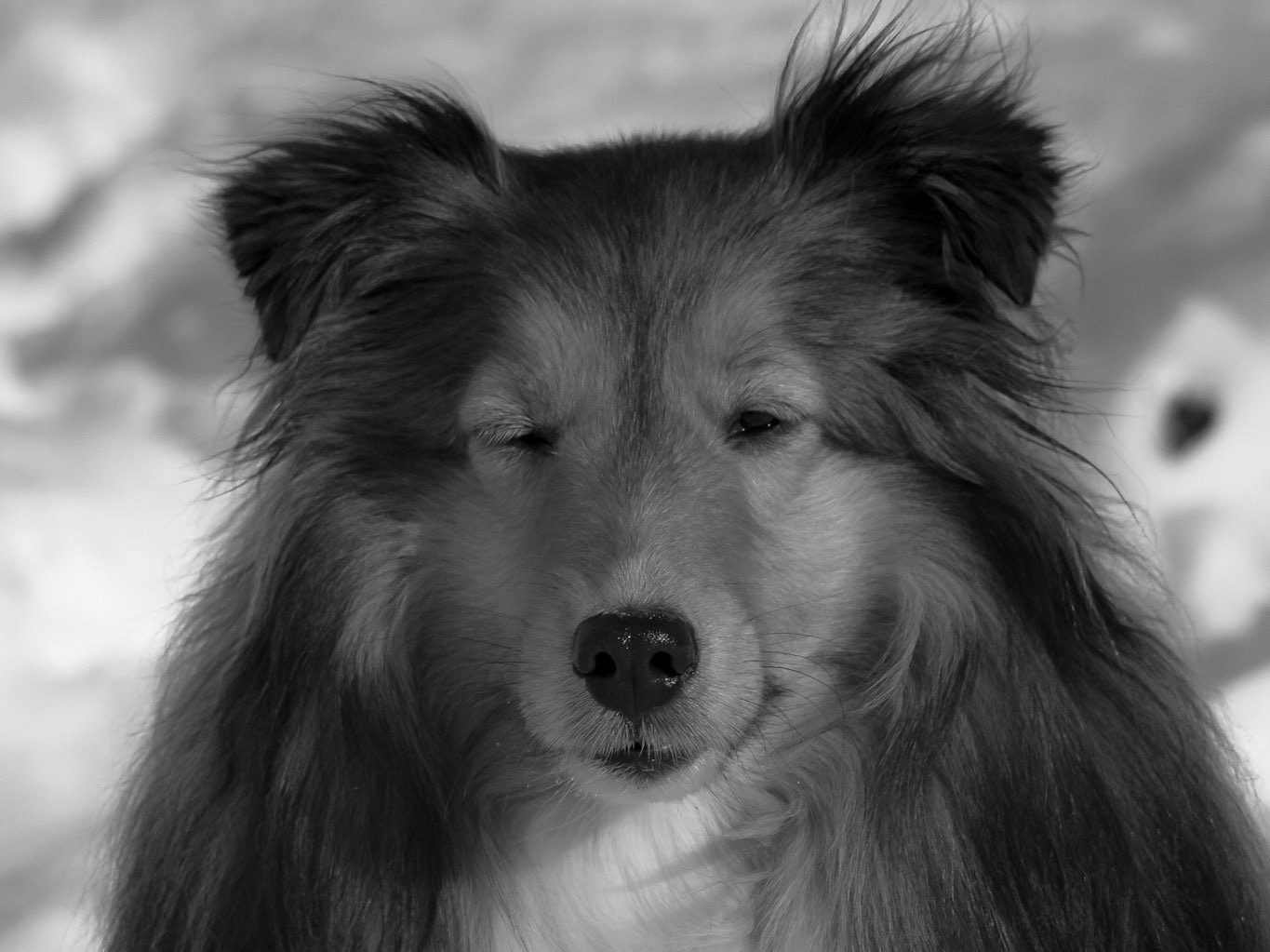
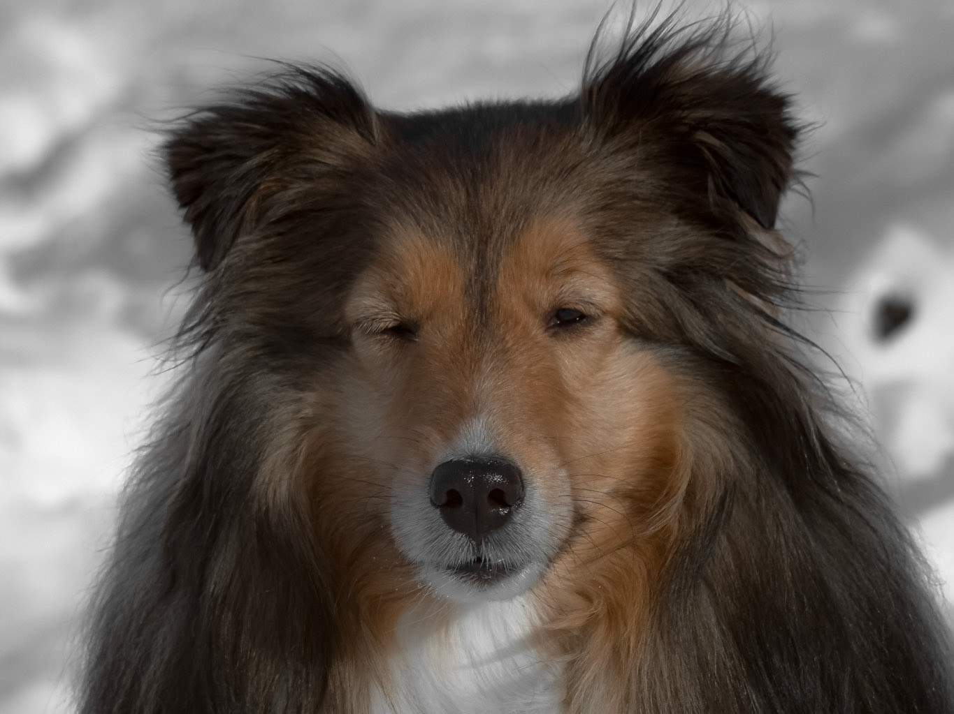
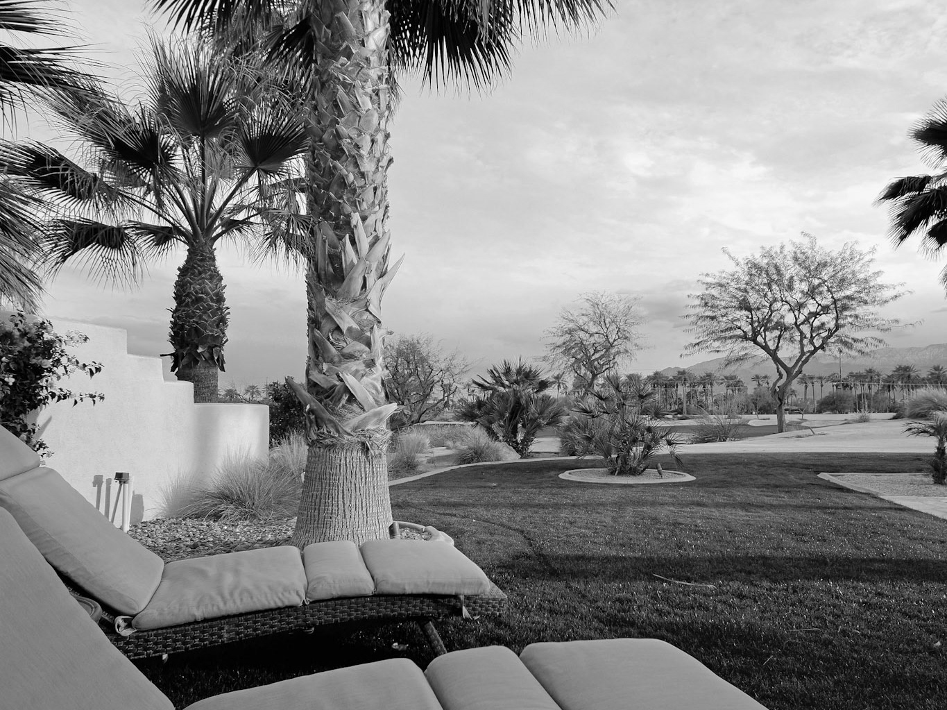
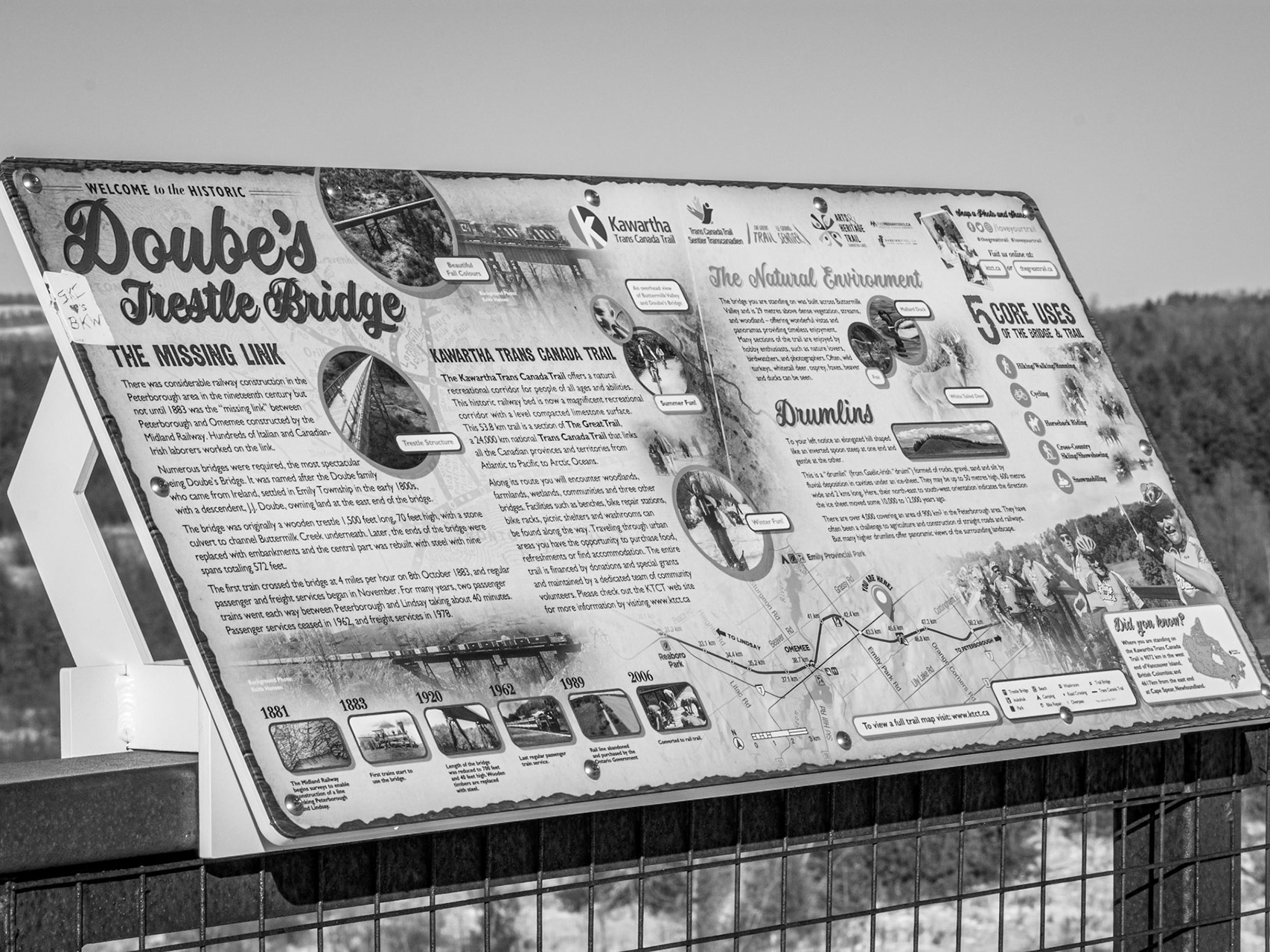
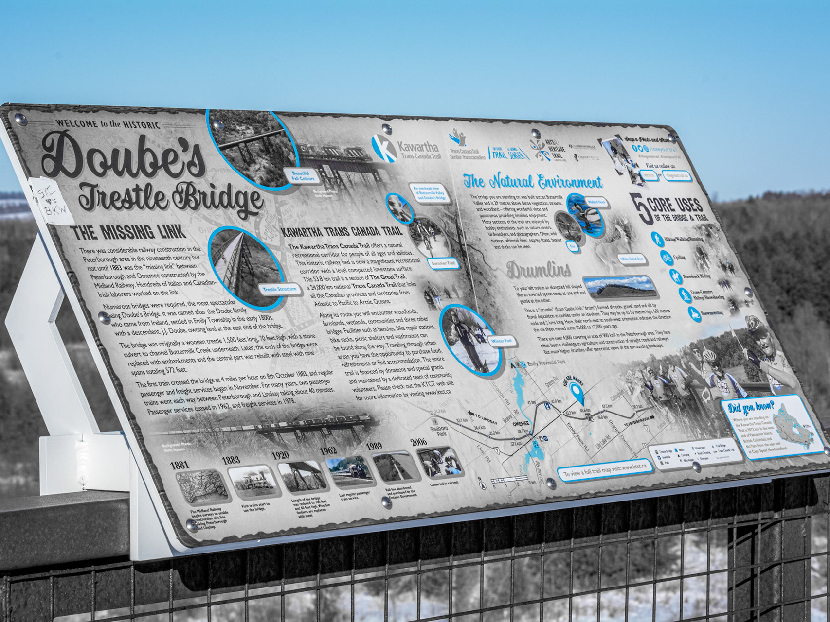
I find yellow the most interesting colour to work with, especially in photos with natural lighting like these nature shots below. On the one hand, the first photo series hardly alters between RAW and selectively yellow - except to grey out the sky. On the other hand, the third photo series has SUCH a drastic change that it looks like a completely separate photo shot from exactly the same angle, and most of that change came just from removing the orange from the wood and the blue from the snow.
From the biggest autumn scenes to the slightest material shine of a birthday gift, yellow is probably my most expansive portfolio in subject range. I could not begin to explain why this is true, perhaps because of the tendency of Lightroom to classify light under the yellow hue: Who knows!? Whatever the reason, it makes winter a fun *yellow season* that I simply adore!
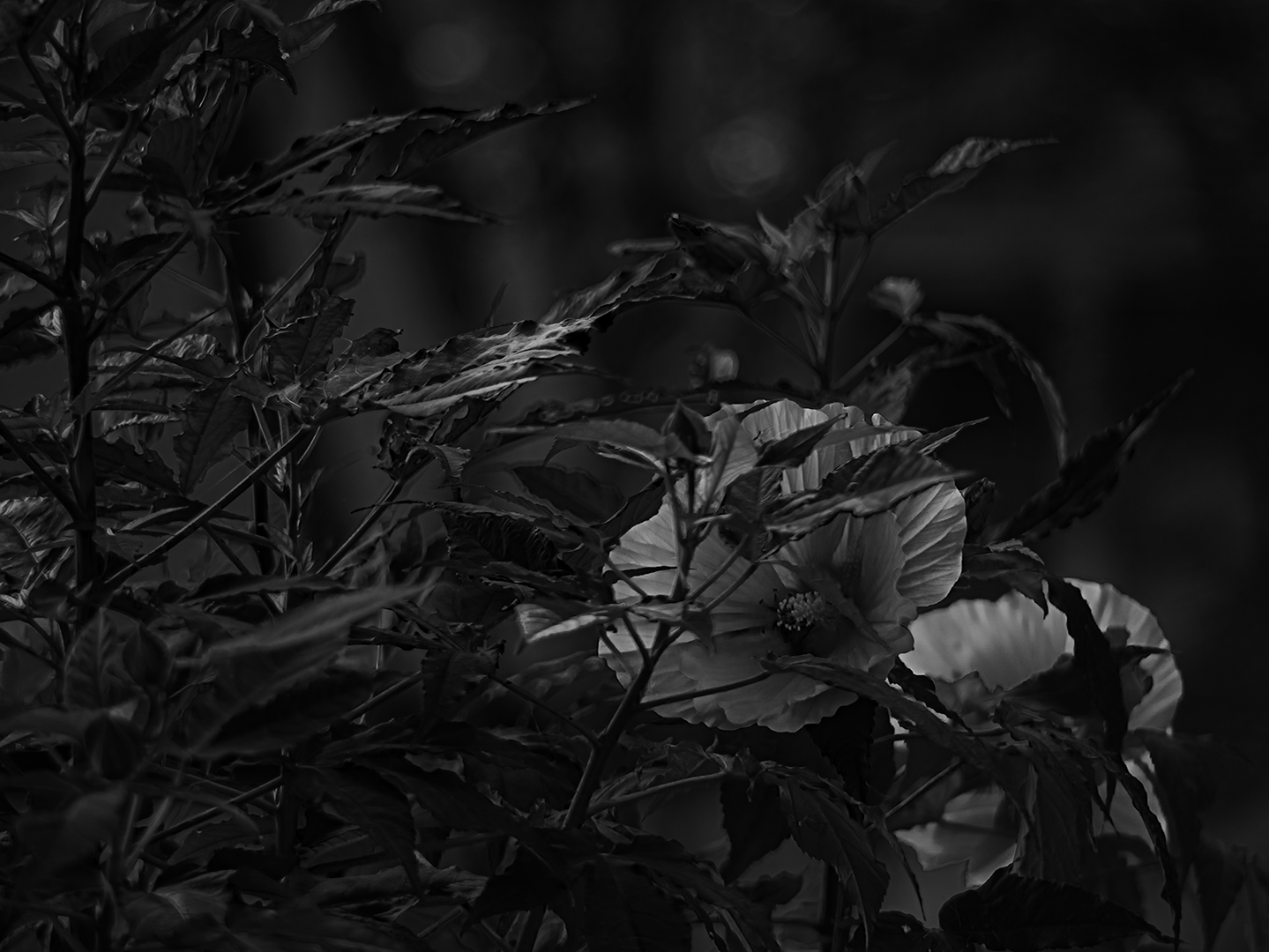
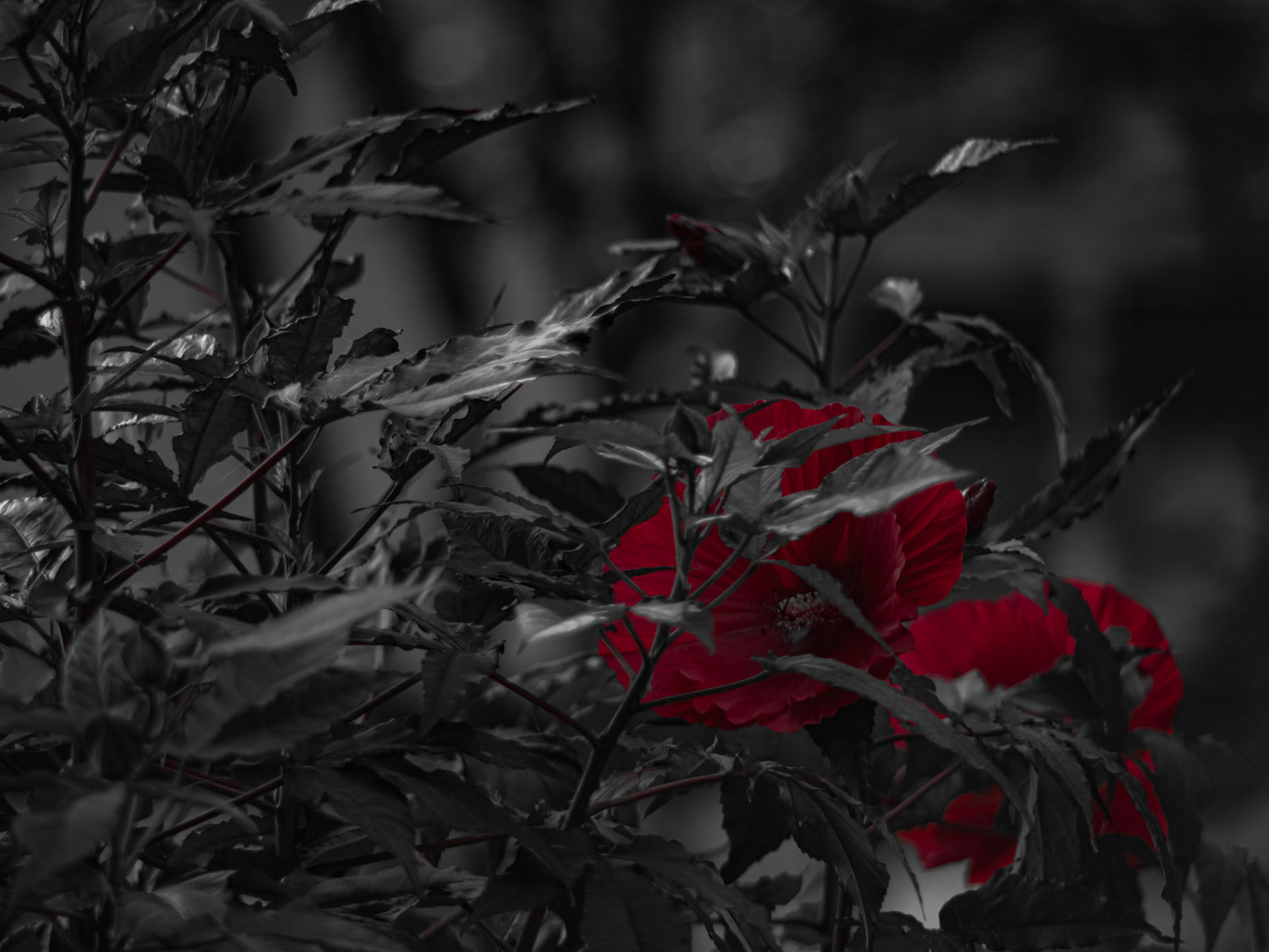
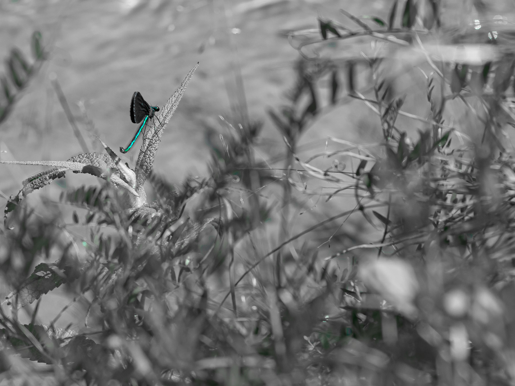
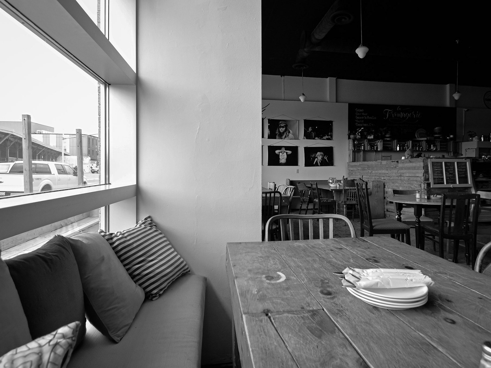
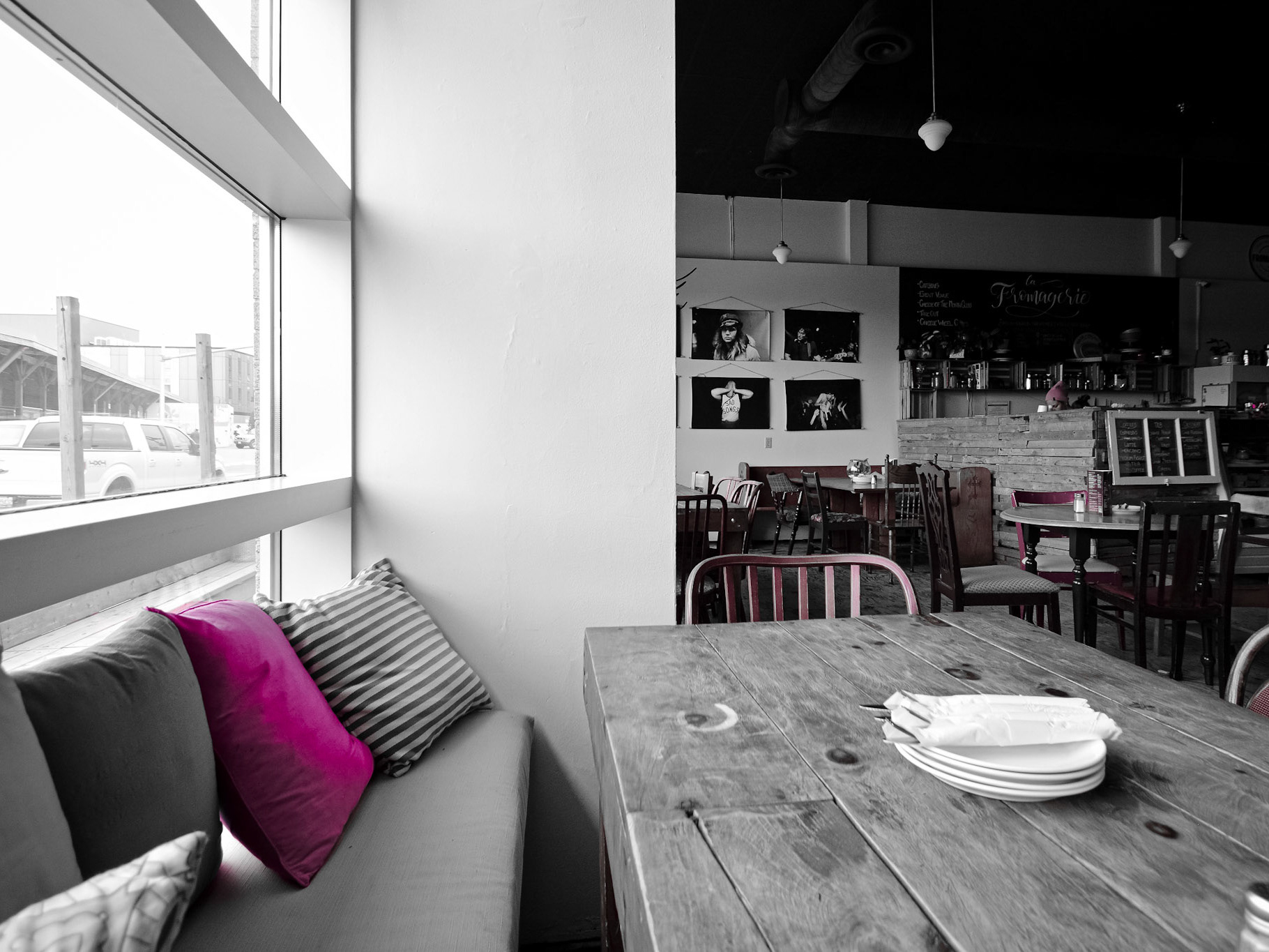
The range of opportunities for pop photography is endless: Check out some other colour progression series' below which now feature all colours of Lightroom's desaturation setting <3
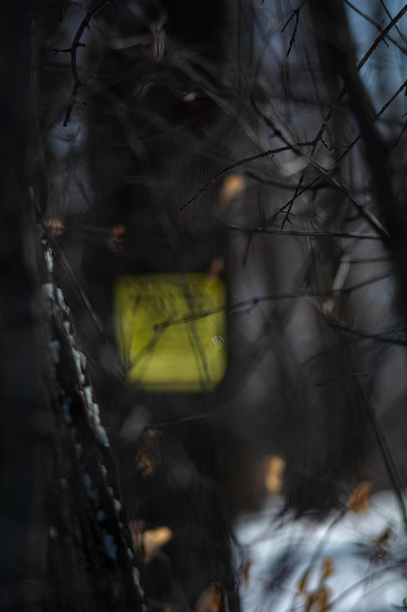
Tresspassing (Take 2) - Full Colour; Shot with: Nikon D5200 + Vivitar 85-205mm.
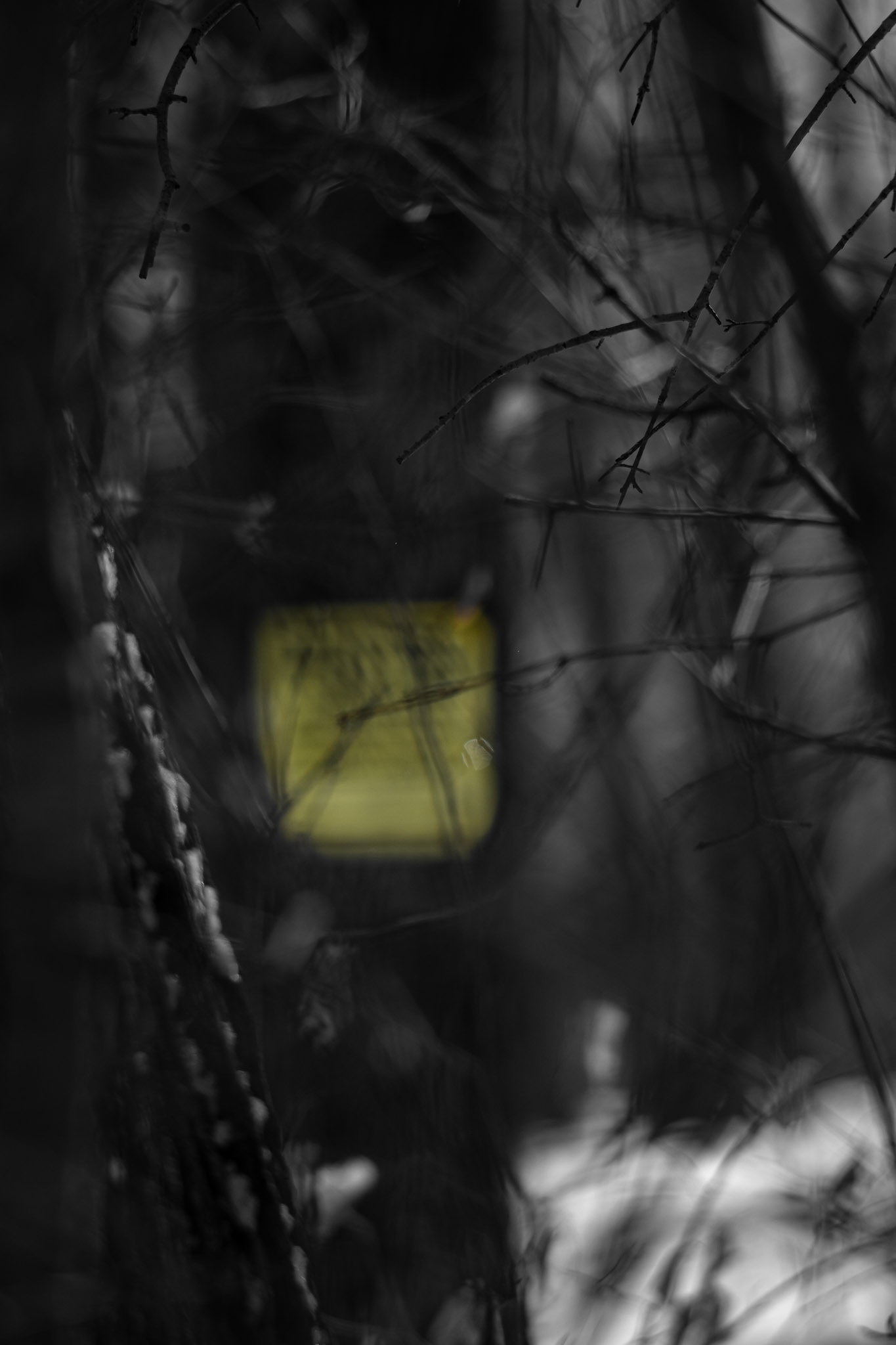
Tresspassing (Take 2) - Yellow Pop; Shot with: Nikon D5200 + Vivitar 85-205mm.
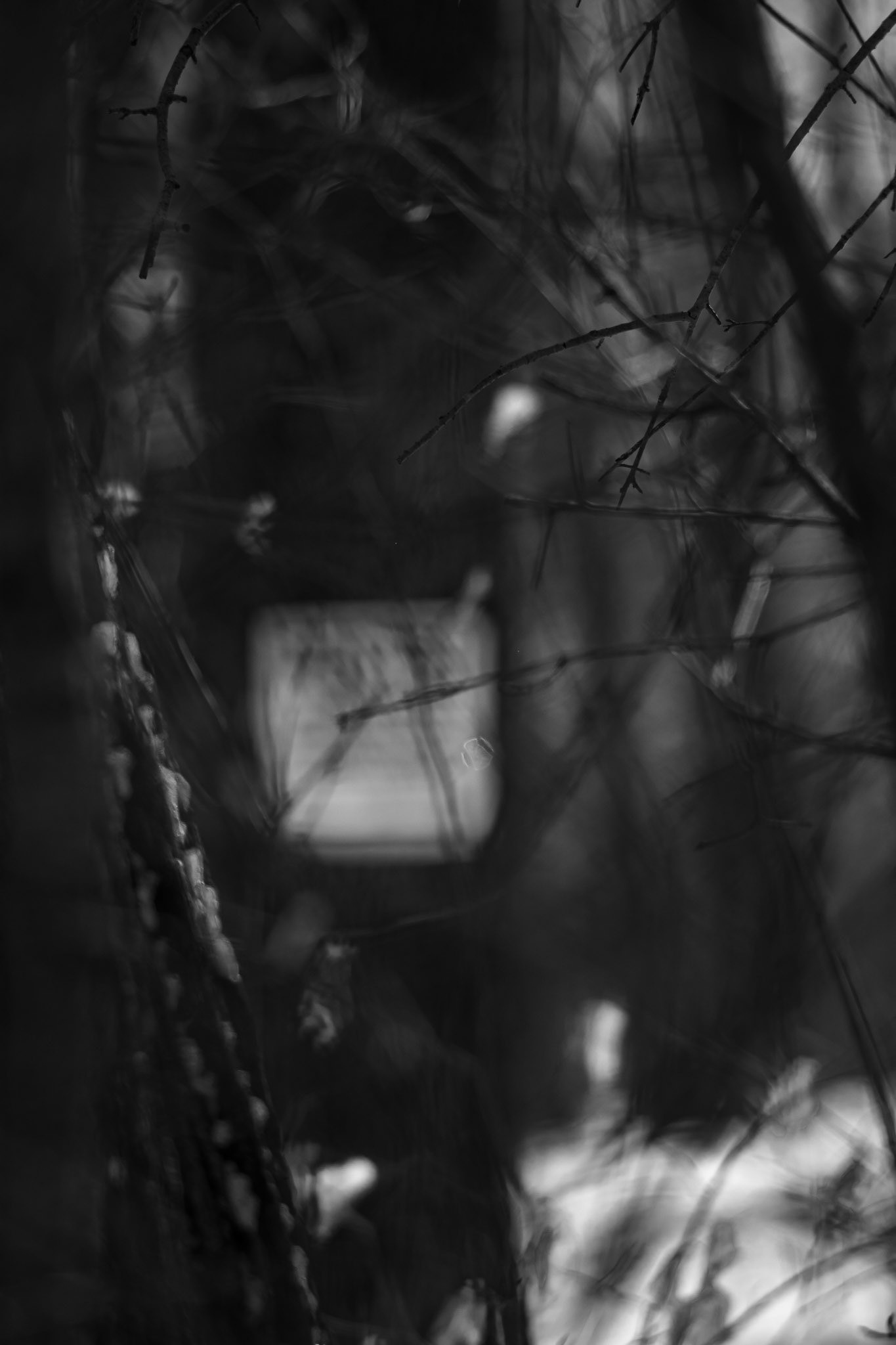
Tresspassing (Take 2) - Black and White; Shot with: Nikon D5200 + Vivitar 85-205mm.

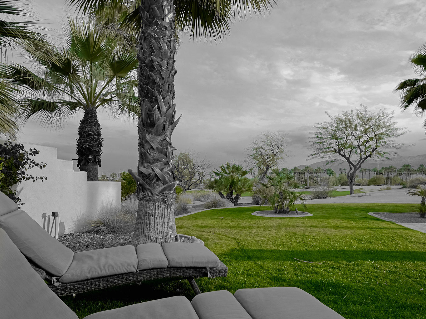
Desert Noasis - Full Colour; Shot with: Nikon D5200 + Tamron 10-24mm.
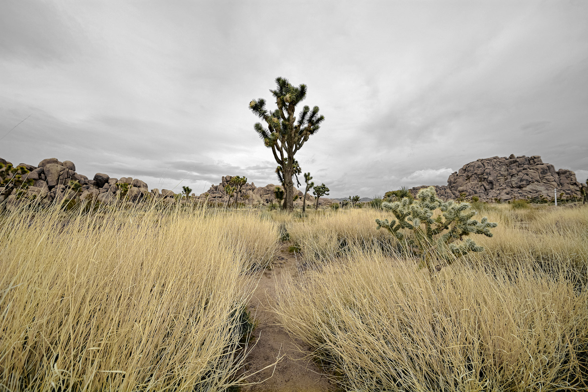
Desert Noasis - Yellow Pop; Shot with: Nikon D5200 + Tamron 10-24mm.
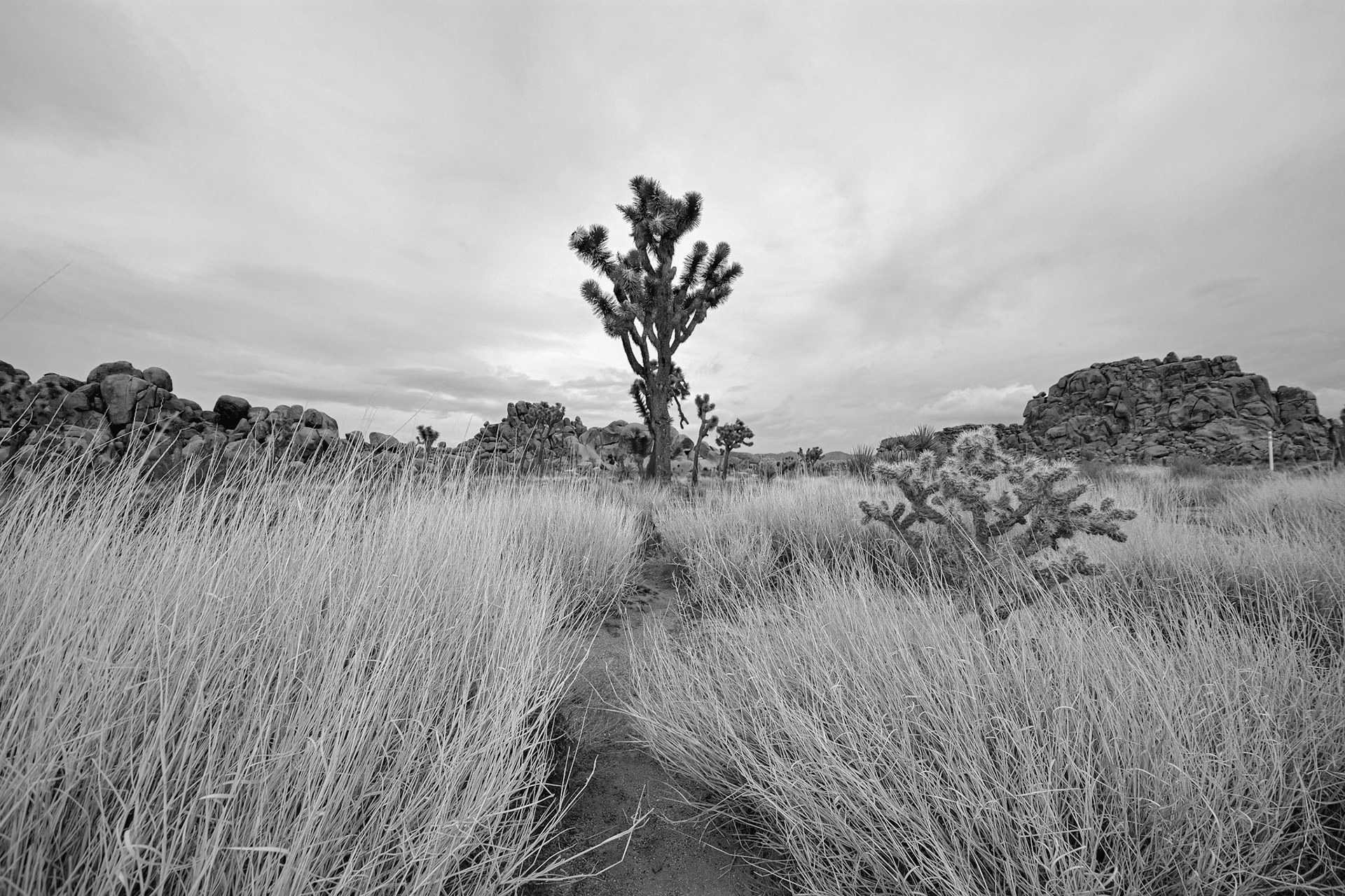
Desert Noasis - Black and White; Shot with: Nikon D5200 + Tamron 10-24mm.

Golden Forest Glow - Full Colour; Shot with: Nikon D5200 + Sigma 70-300mm.
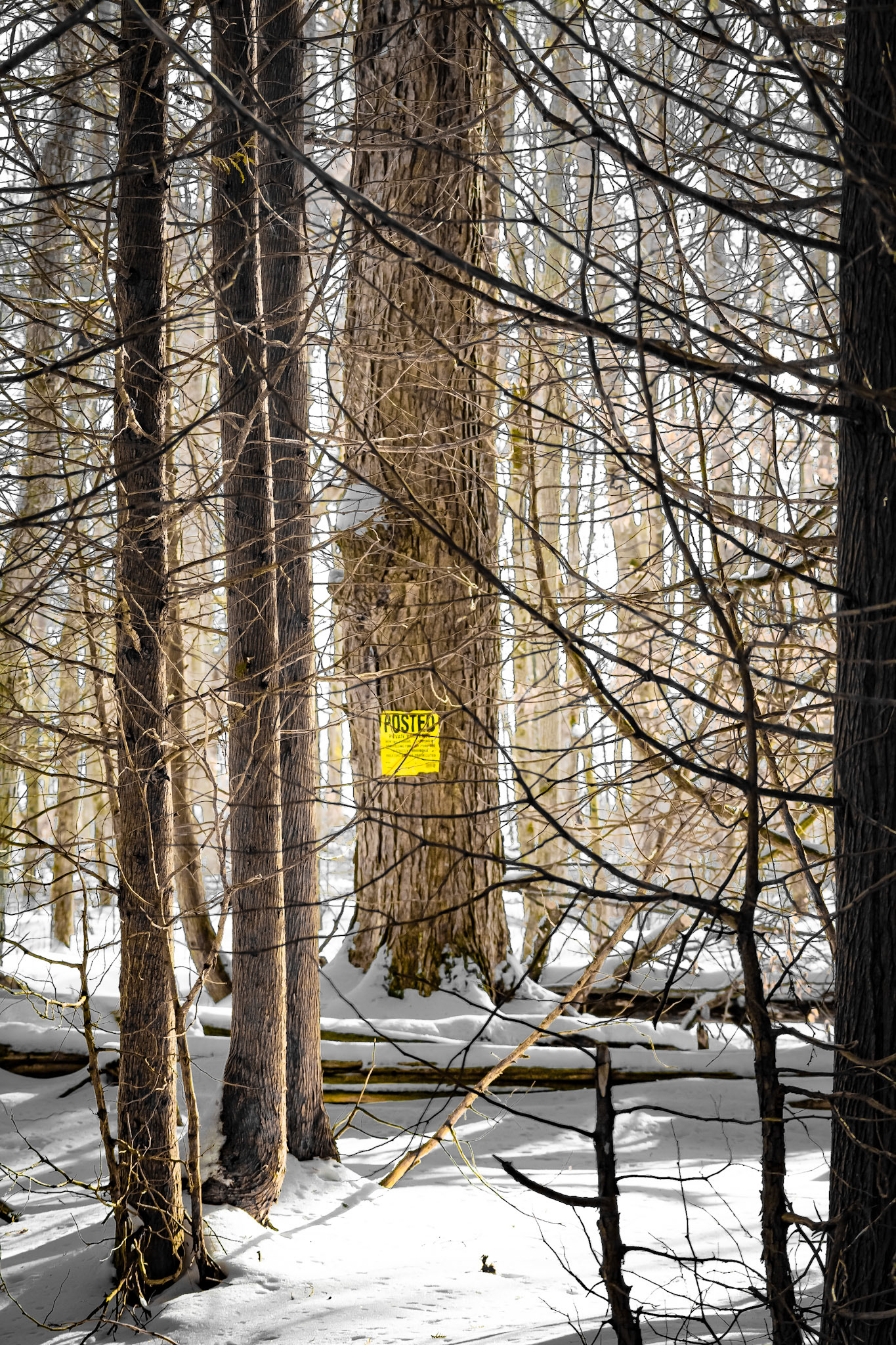
Golden Forest Glow - Yellow Pop; Shot with: Nikon D5200 + Sigma 70-300mm.
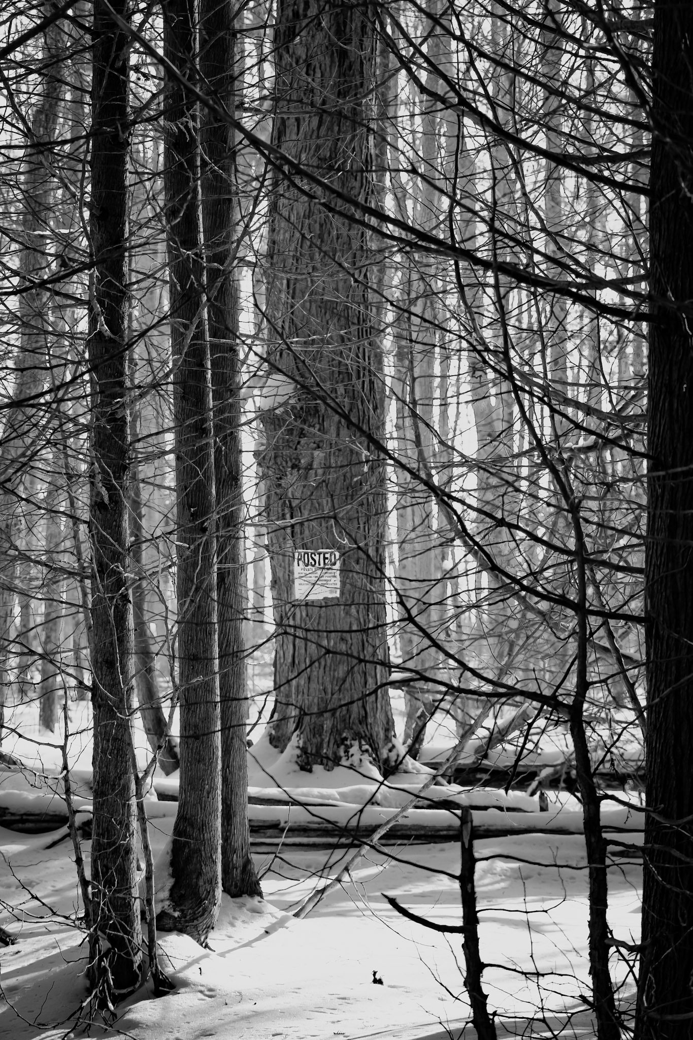
Golden Forest Glow - Black and White; Shot with: Nikon D5200 + Sigma 70-300mm.
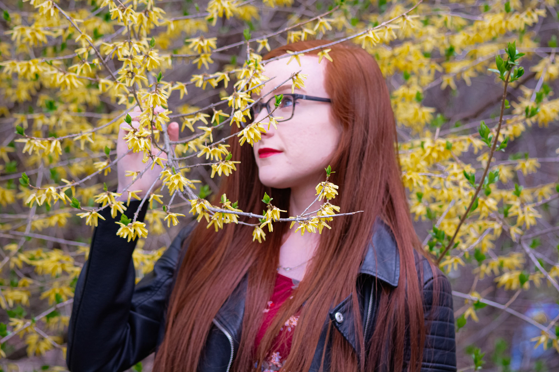
Spring Snapshot - Full Colour; Shot with: Nikon D5200 + Sigma 70-300mm.
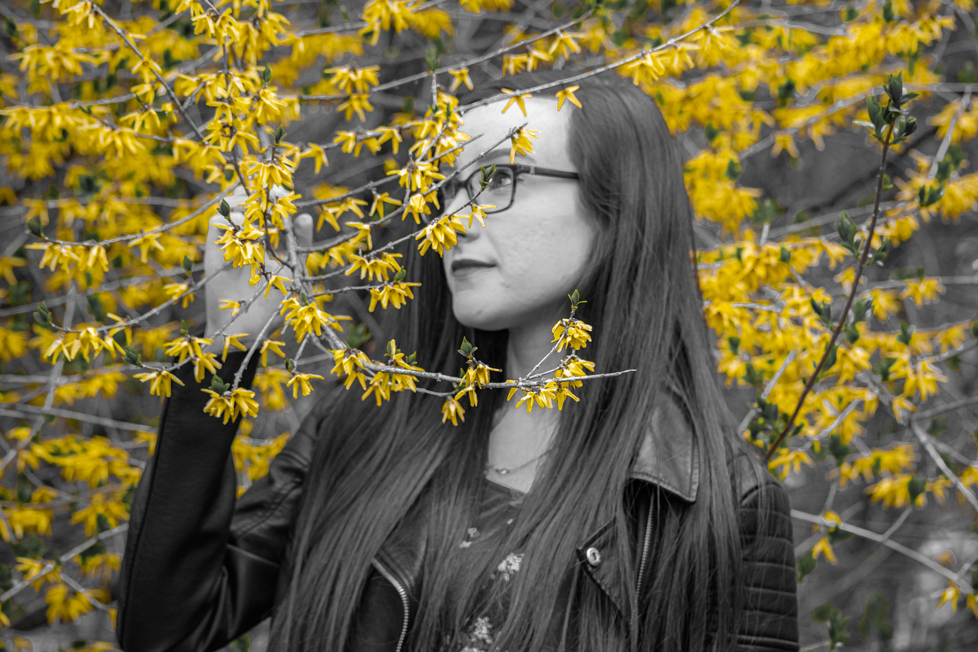
Spring Snapshot - Yellow Pop; Shot with: Nikon D5200 + Sigma 70-300mm.
