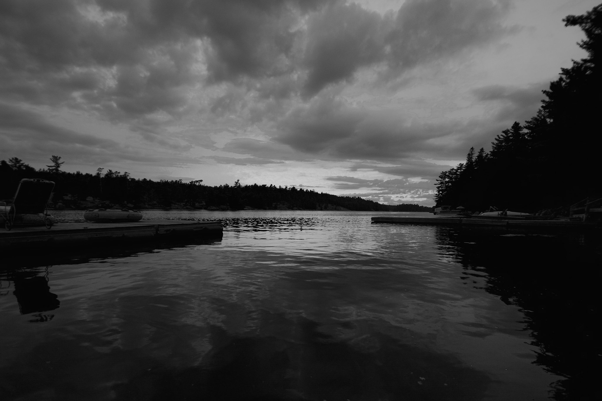
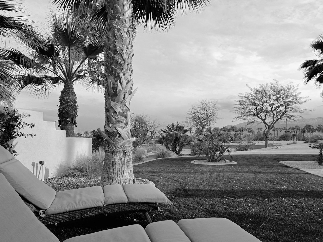
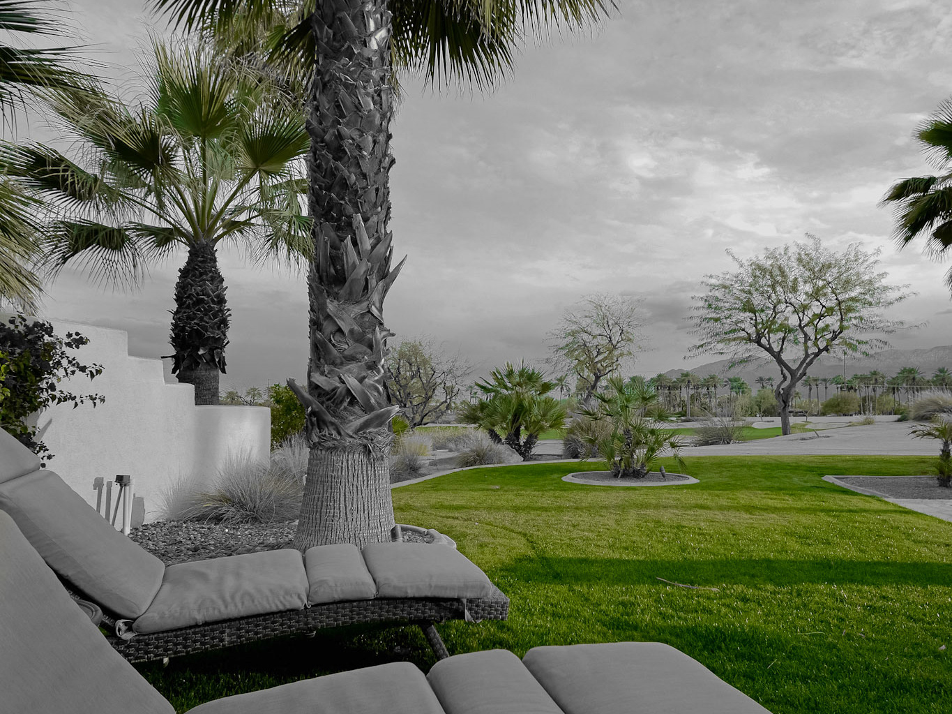
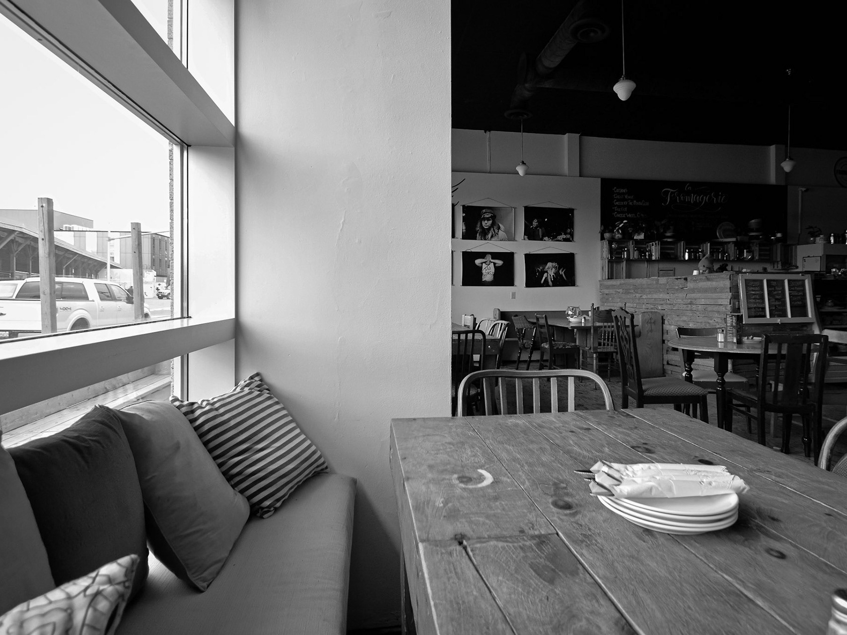
Unlike blue, I had far less options when it came to purple. Although, that does give me an opportunity to mentioned another great feature of Lightroom: Hue changing.
I'm sure you can tell that, in the first photo series below, the ribbon has been altered slightly into a more authentic purple. While I do try to avoid editing the actual colours of my photos when desaturating, sometimes the payoff is simply too great to avoid altering that hue code just a little to end up with a masterpiece that I simply adore!
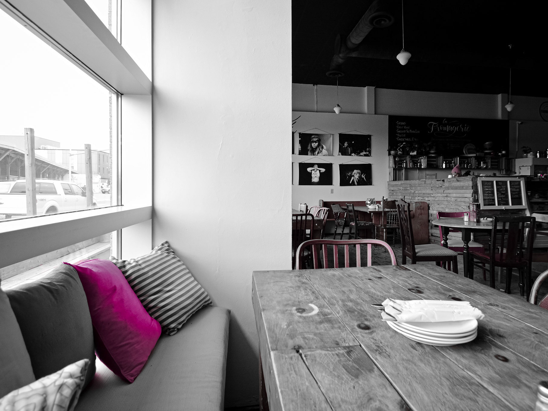
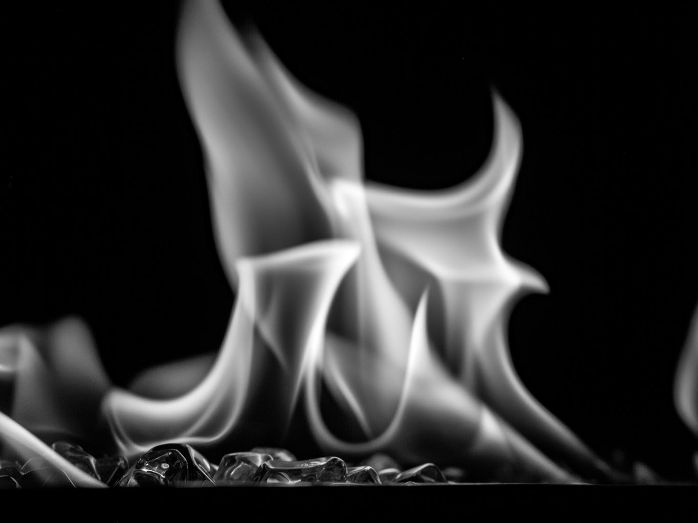
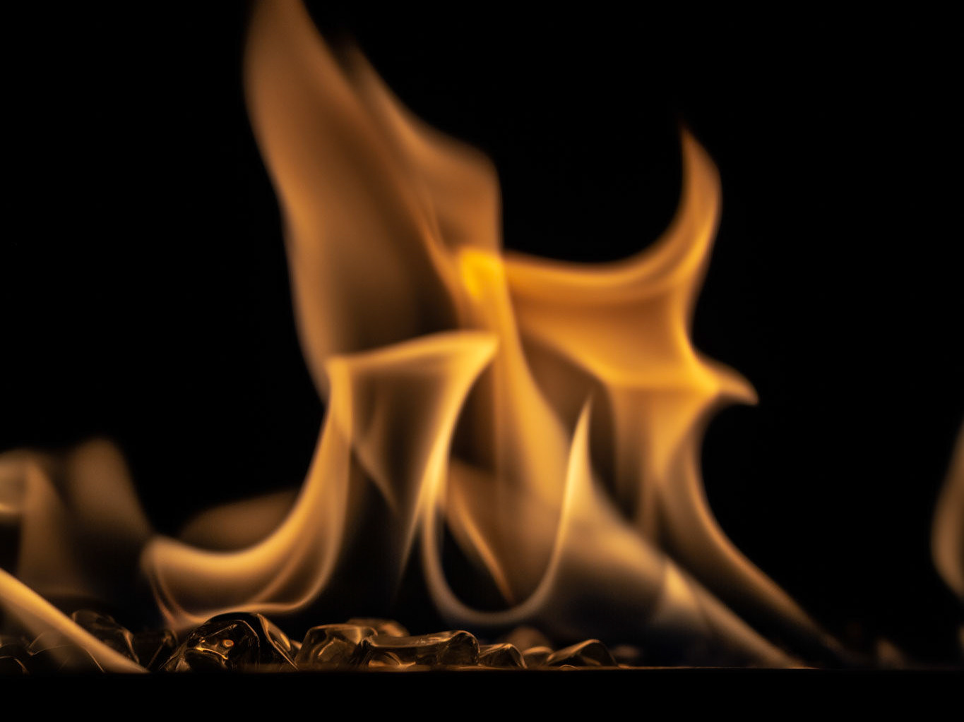
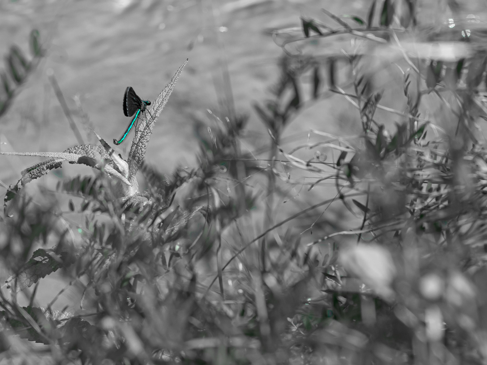
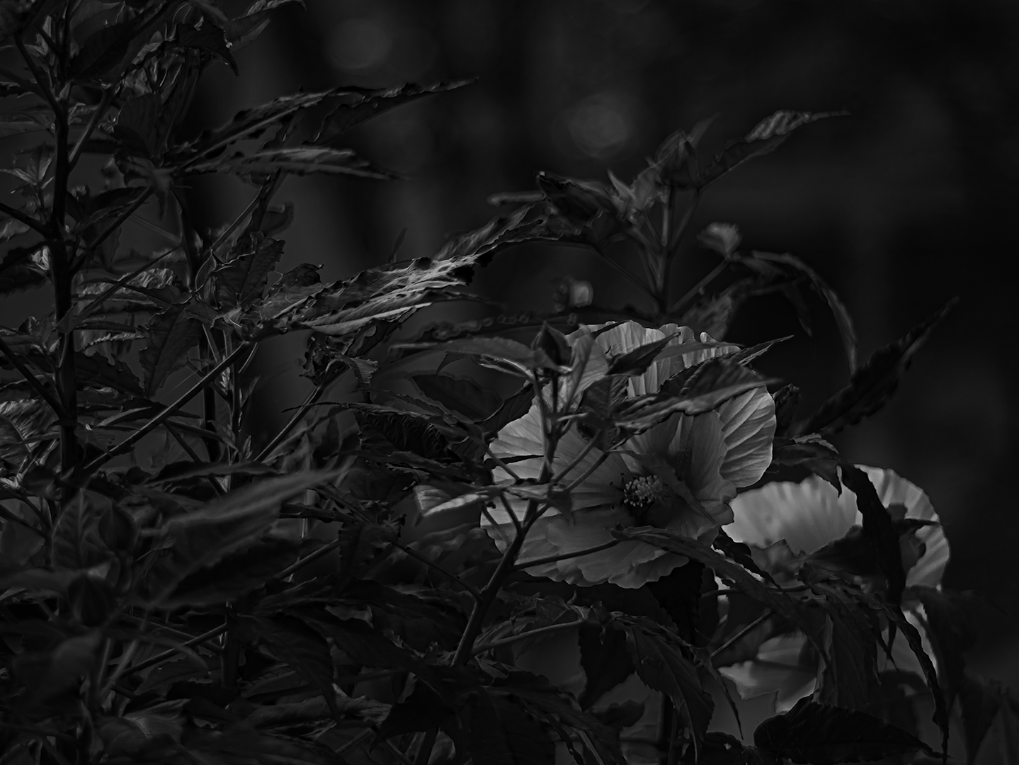
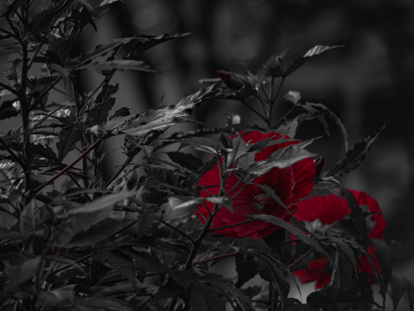
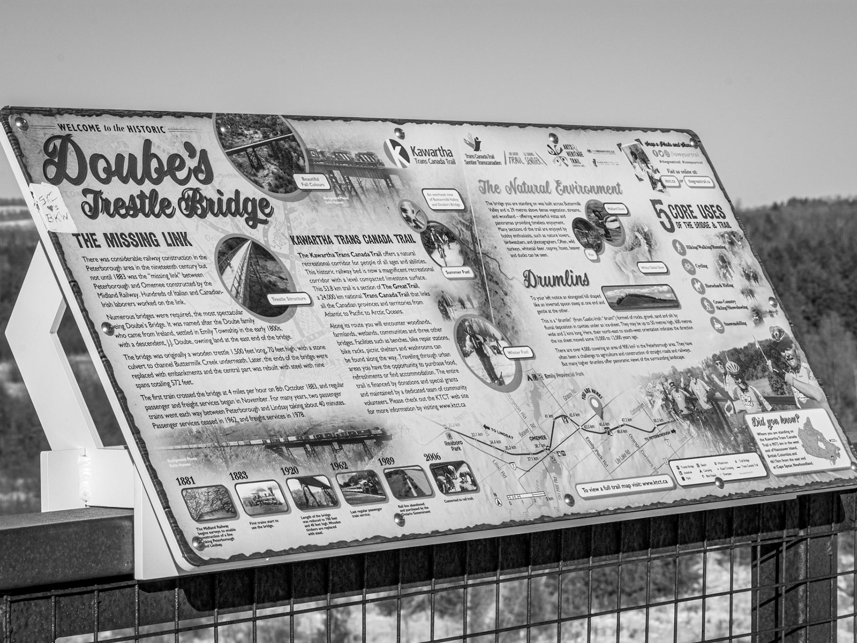
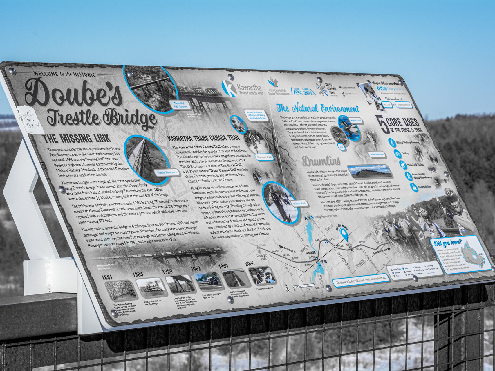
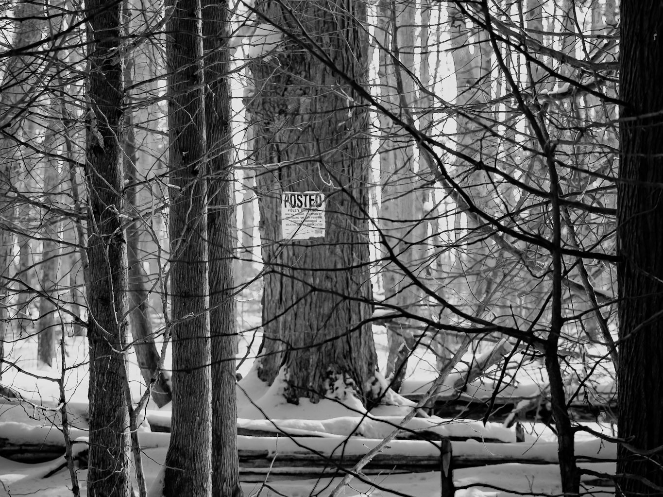
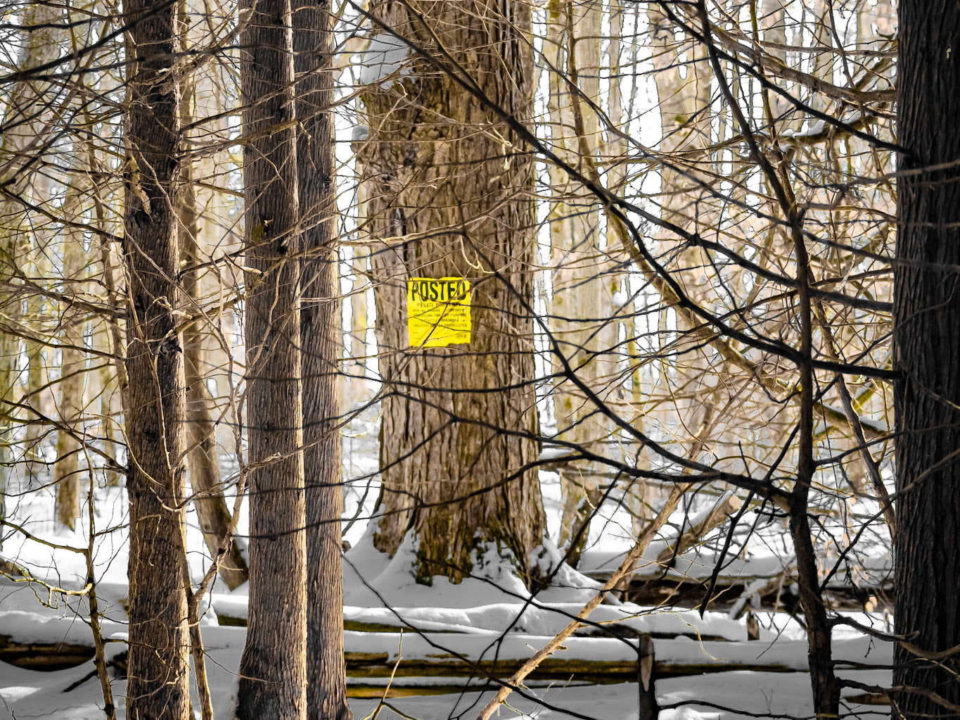
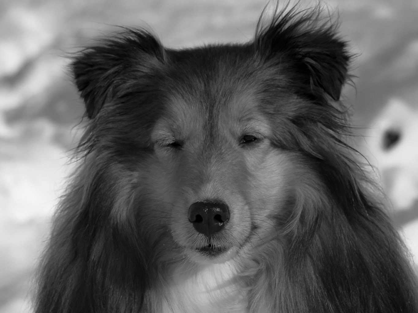
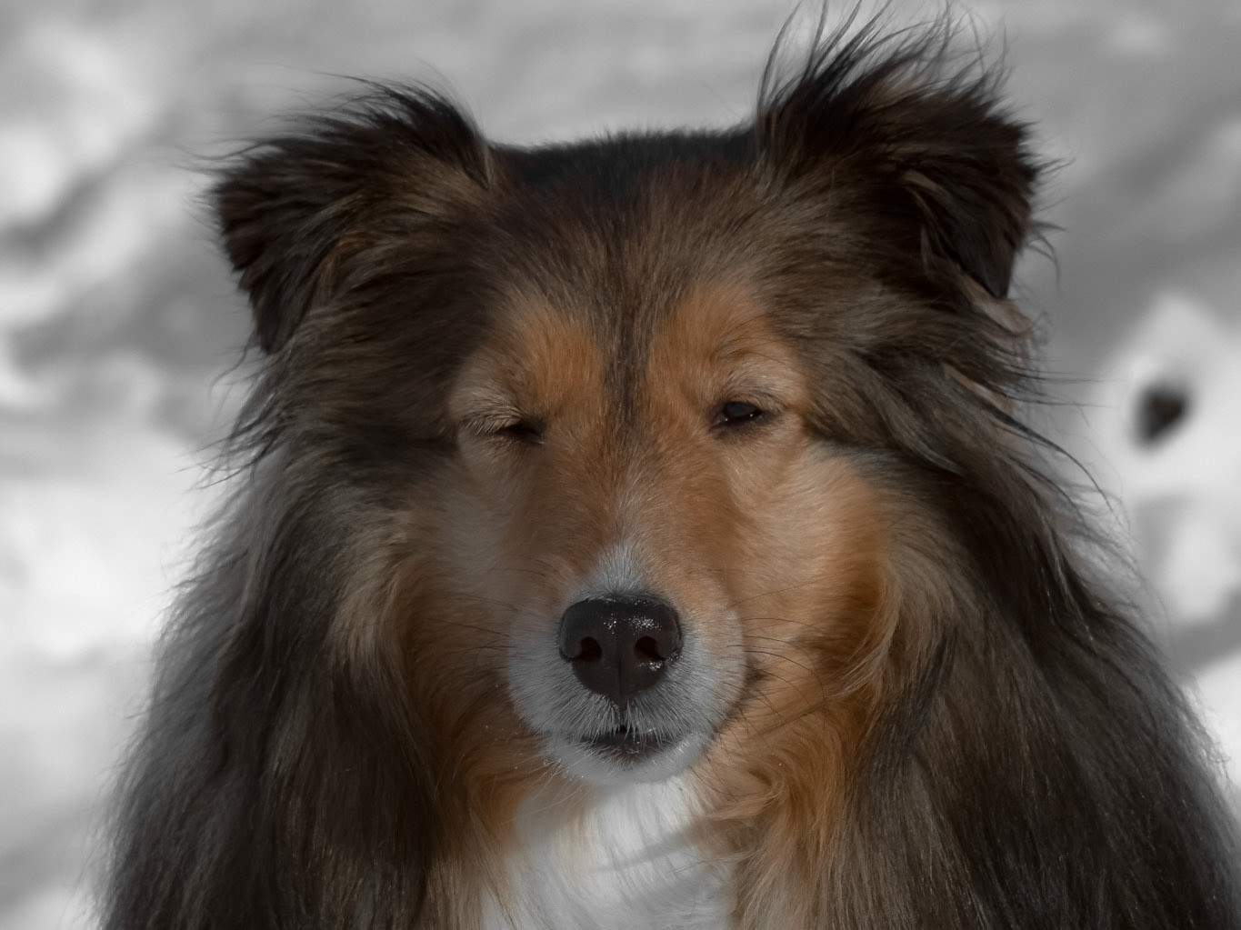
The range of opportunities for pop photography is endless: Check out some other colour progression series' below which now feature all colours of Lightroom's desaturation setting <3
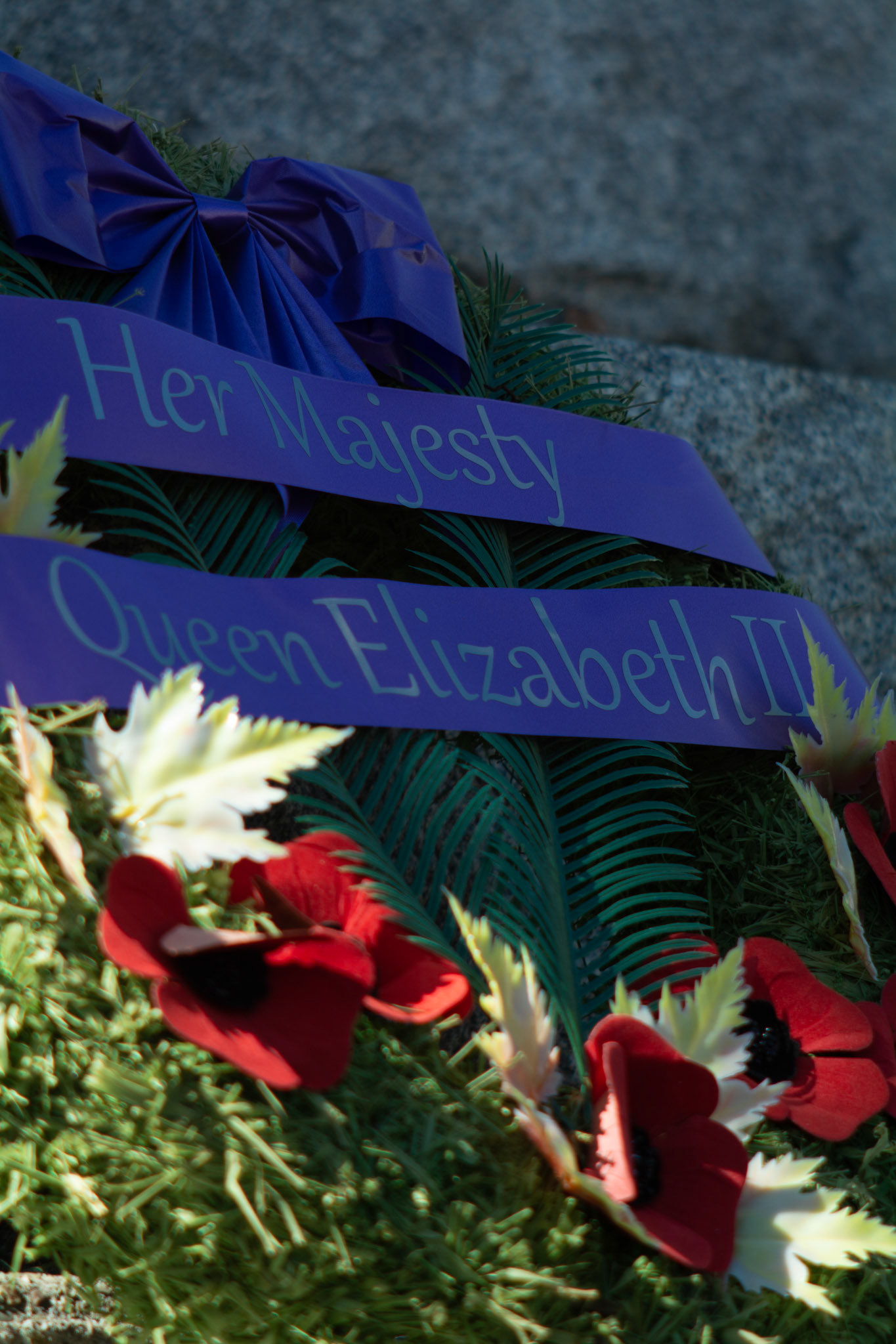
Royal Remembrance - Full Colour; Shot with: Nikon D5200 + Vivitar 85-205mm.
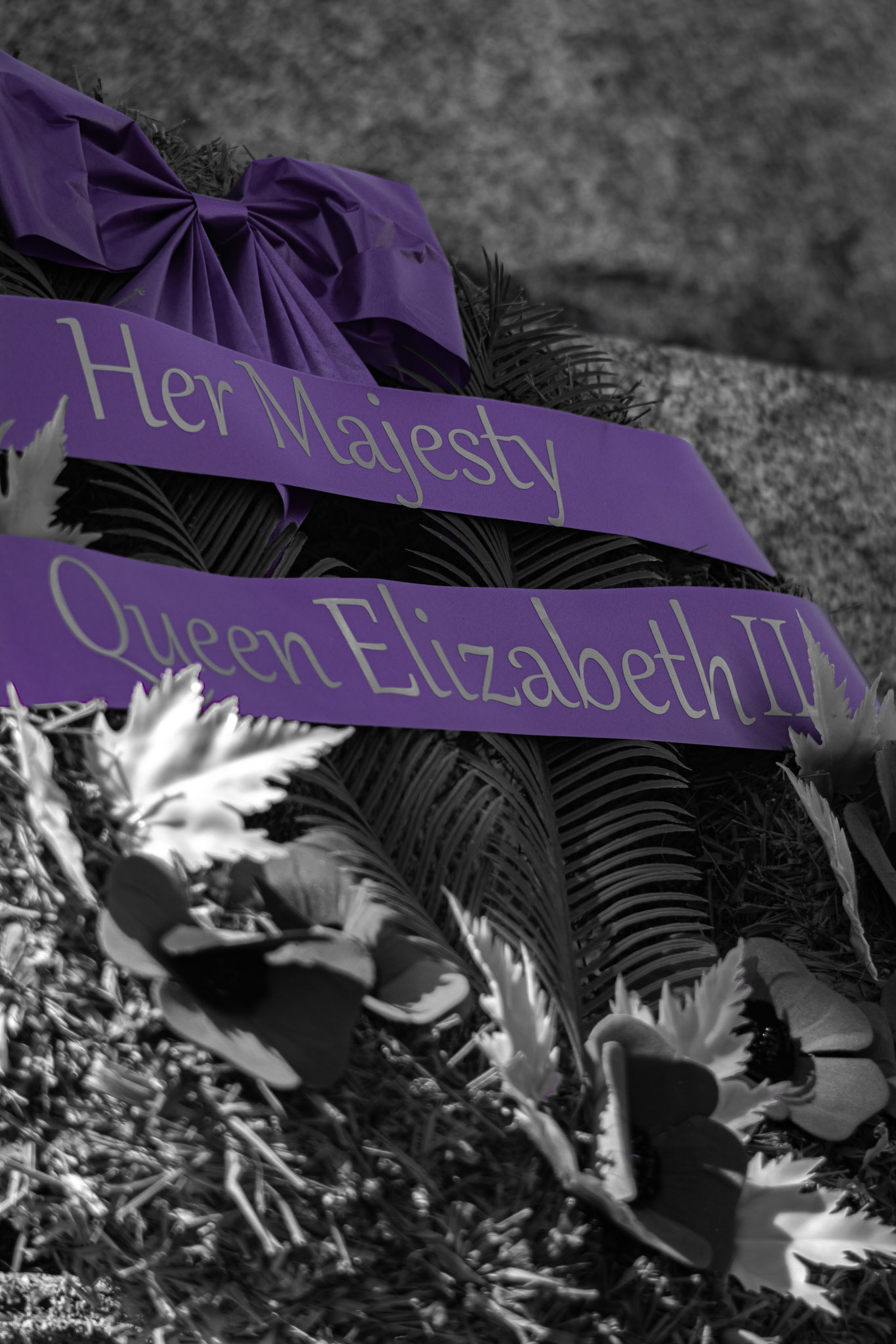
Royal Remembrance - Purple Pop; Shot with: Nikon D5200 + Vivitar 85-205mm.
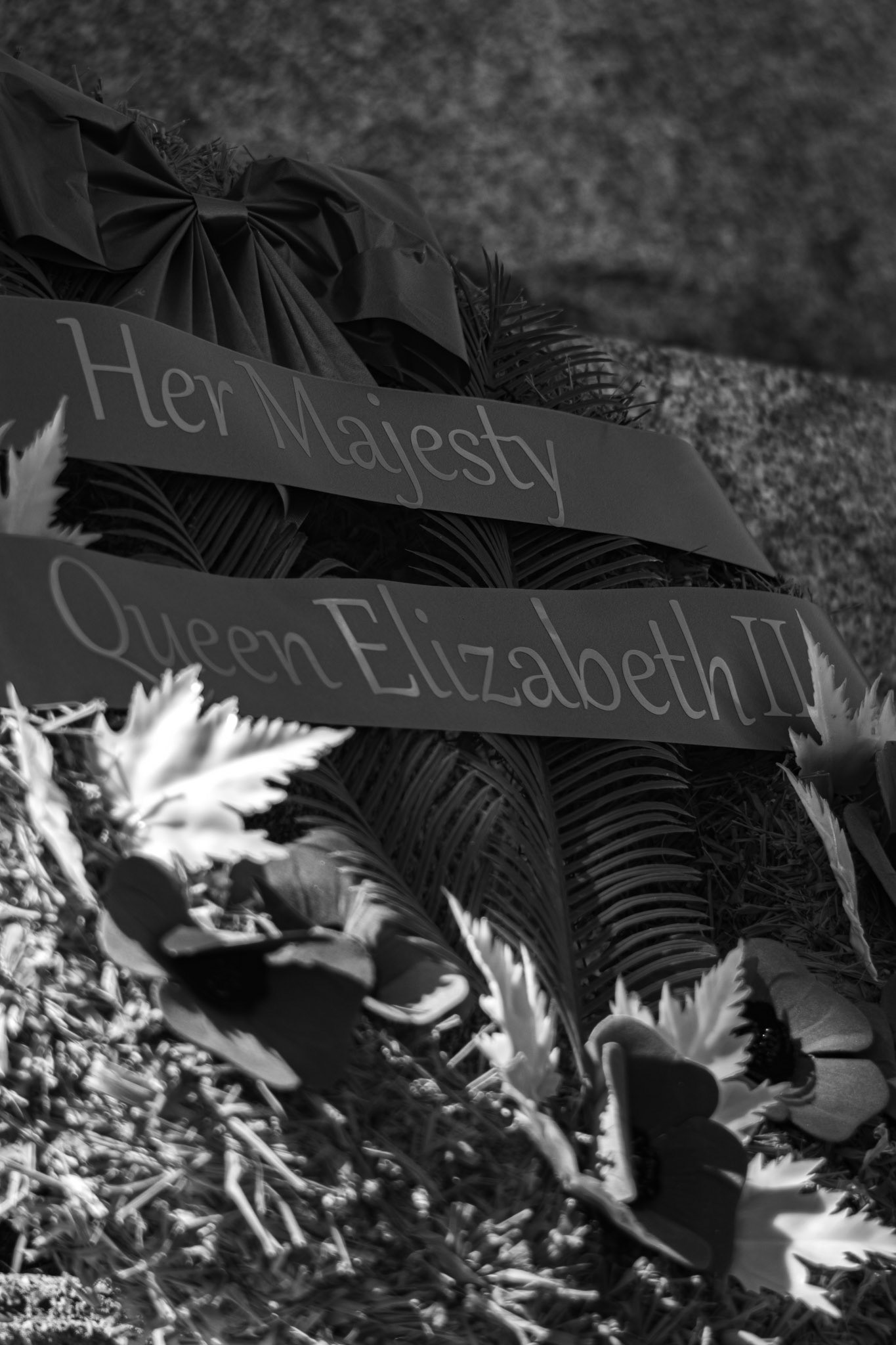
Royal Remembrance - Black and White; Shot with: Nikon D5200 + Vivitar 85-205mm.
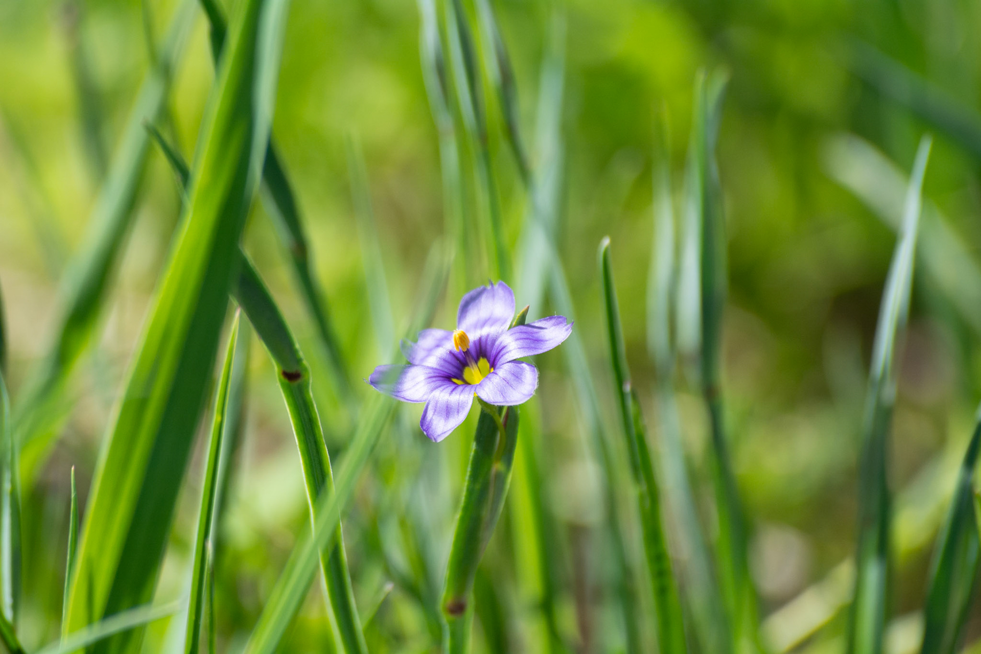
Tiny Bloomer - Full Colour; Shot with: Nikon D5200 + Sigma 70-300mm.
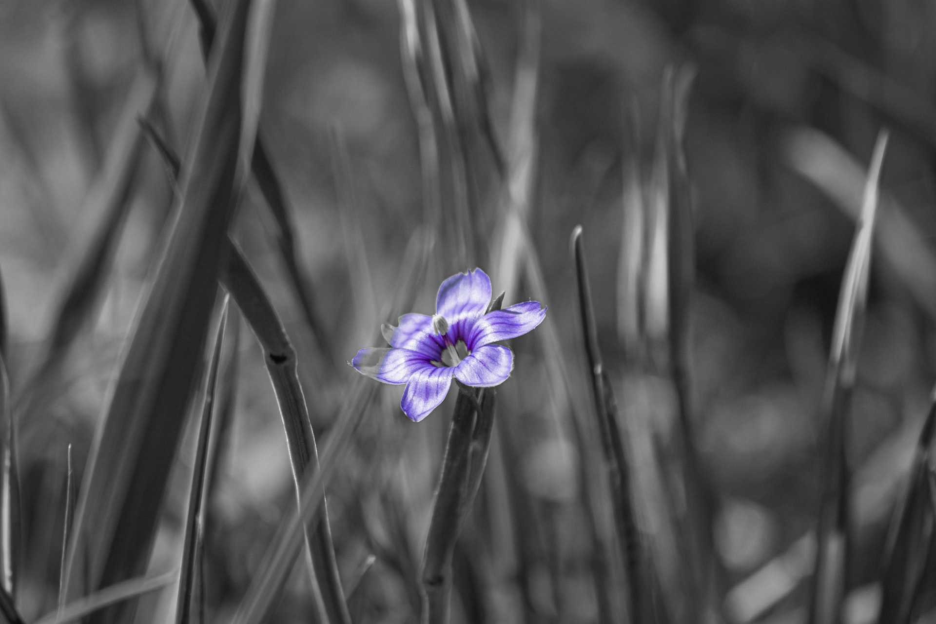
Tiny Bloomer - Purple Pop; Shot with: Nikon D5200 + Sigma 70-300mm.
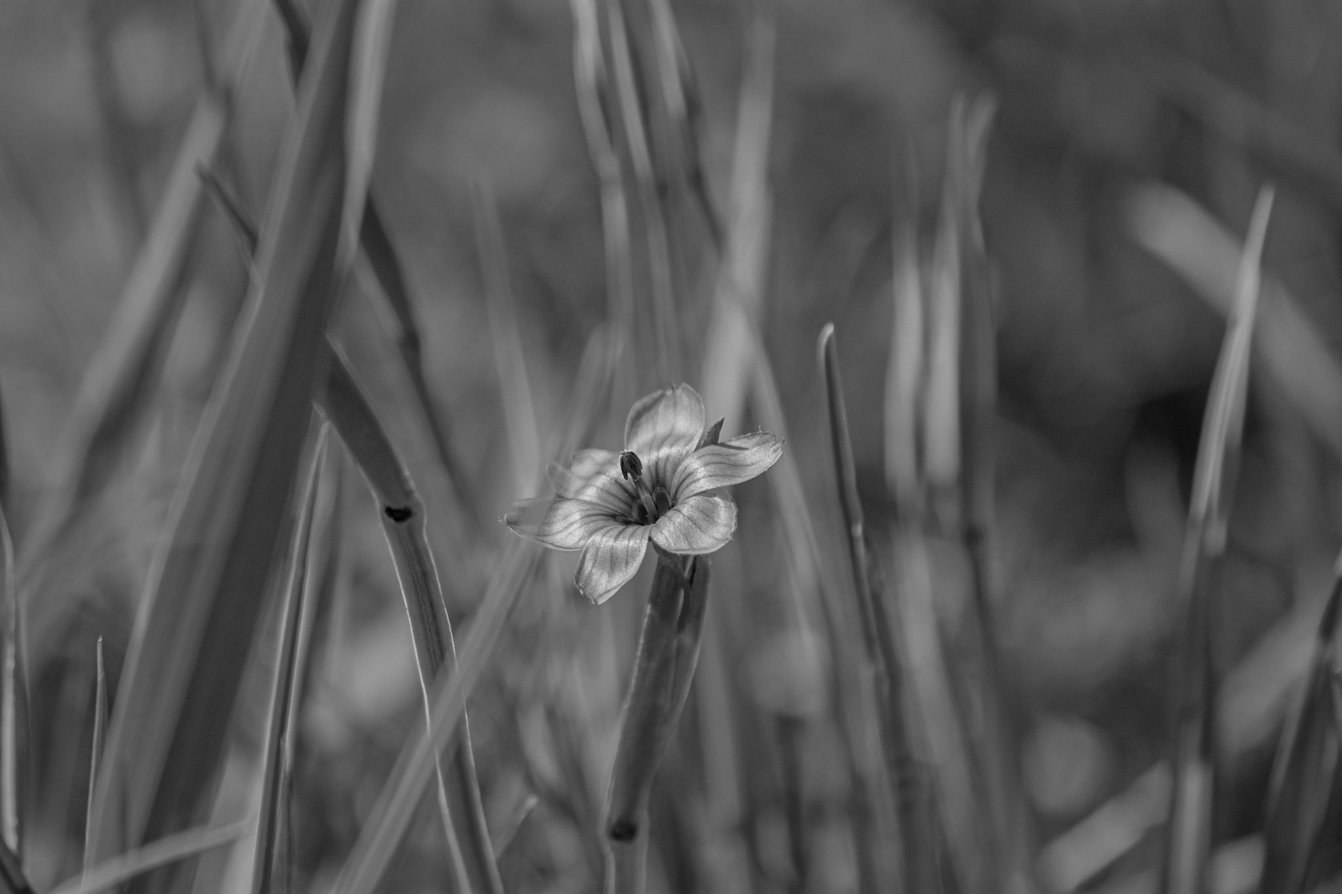
Tiny Bloomer - Black and White; Shot with: Nikon D5200 + Sigma 70-300mm.
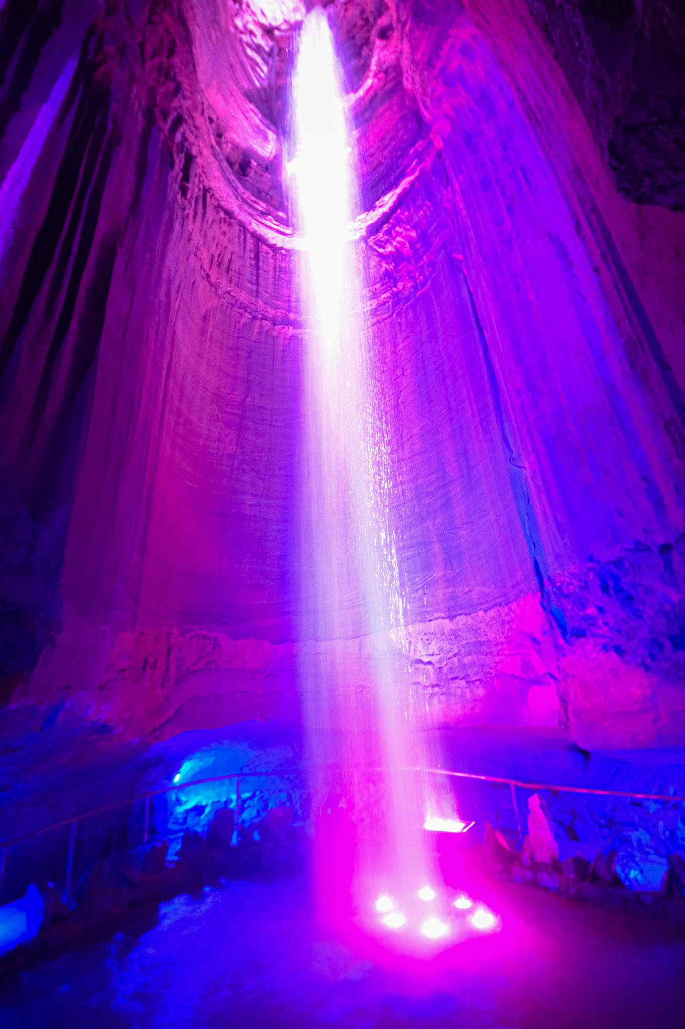
Ruby Falls, TN - Full Colour; Shot with: Nikon D5200 + Tamron 10-24mm.
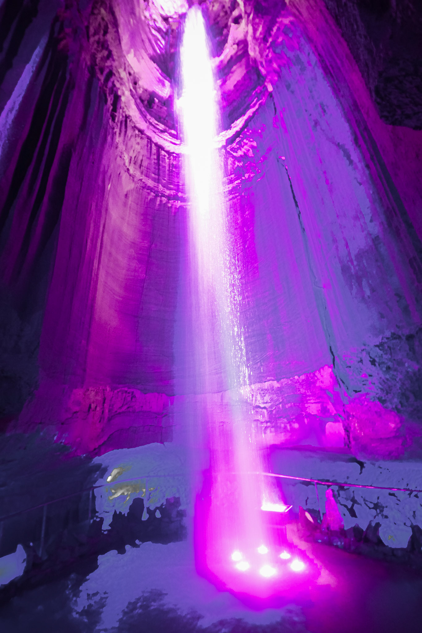
Ruby Falls, TN - Purple Pop; Shot with: Nikon D5200 + Tamron 10-24mm.

Ruby Falls, TN - Black and White; Shot with: Nikon D5200 + Tamron 10-24mm.
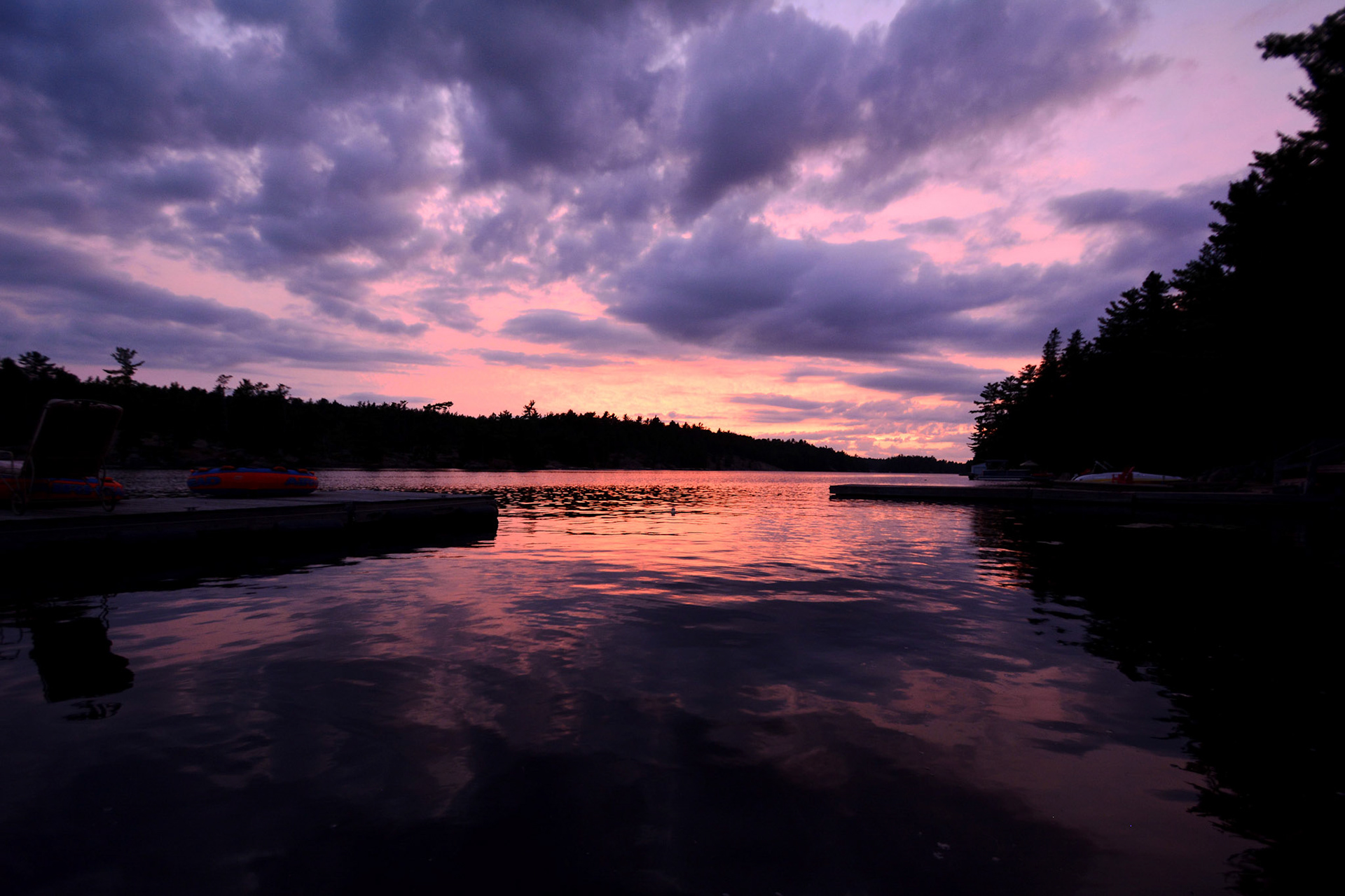
Peaceful Pastimes - Full Colour; Shot with: Nikon D5200 + Tamron 10-24mm.
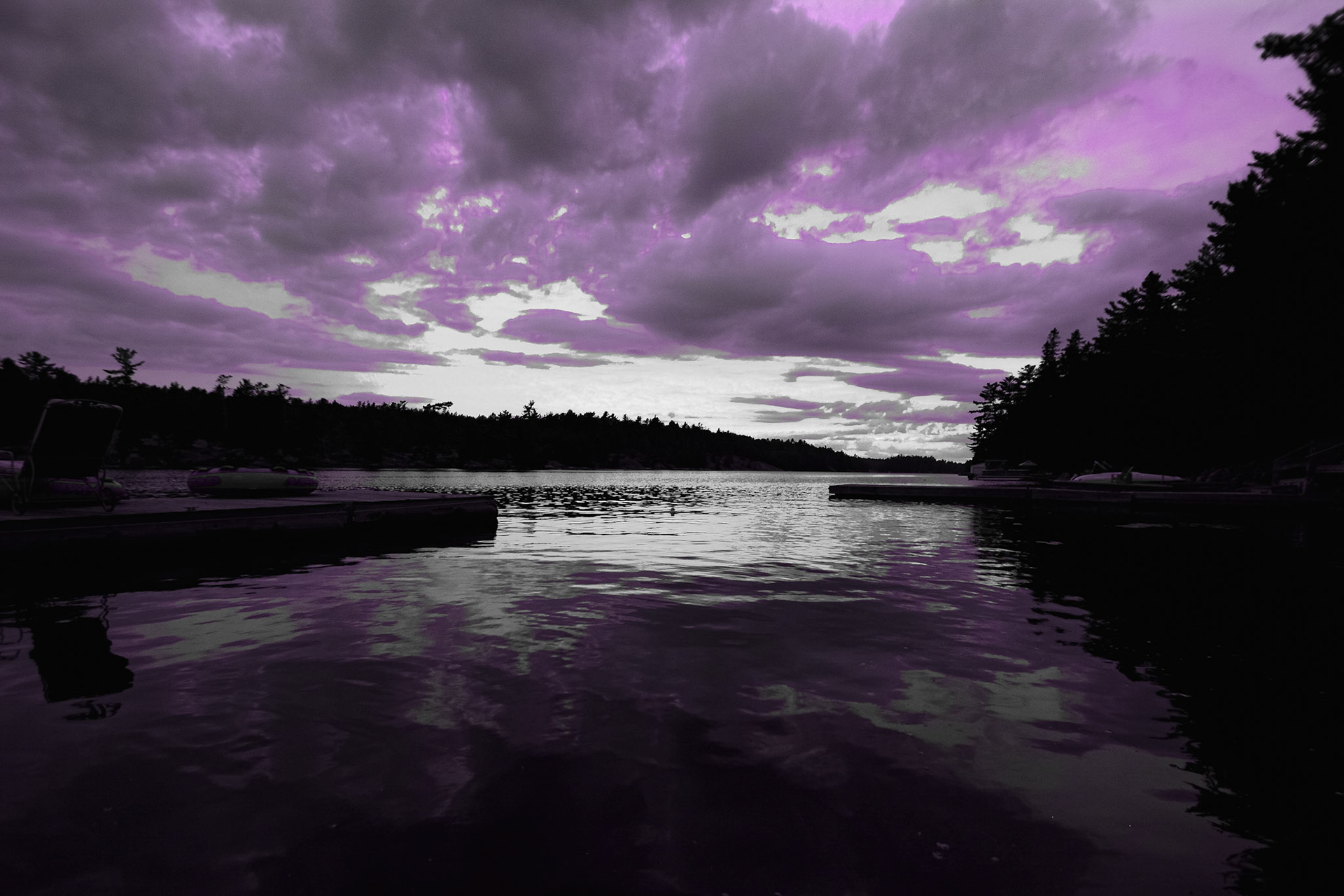
Peaceful Pastimes - Purple Pop; Shot with: Nikon D5200 + Tamron 10-24mm.
